 Esp
Esp
UX/UI/Research - Case Studies
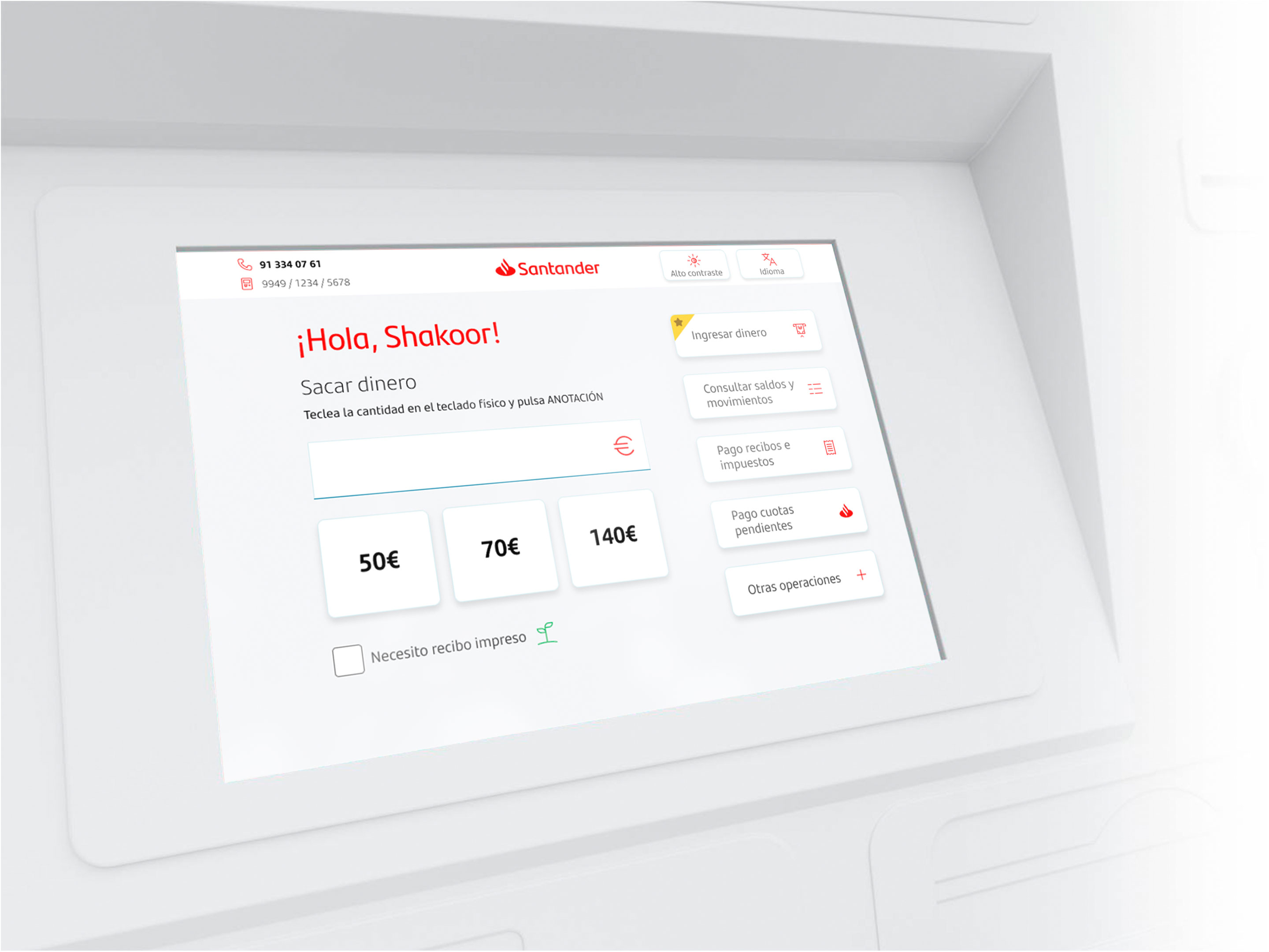

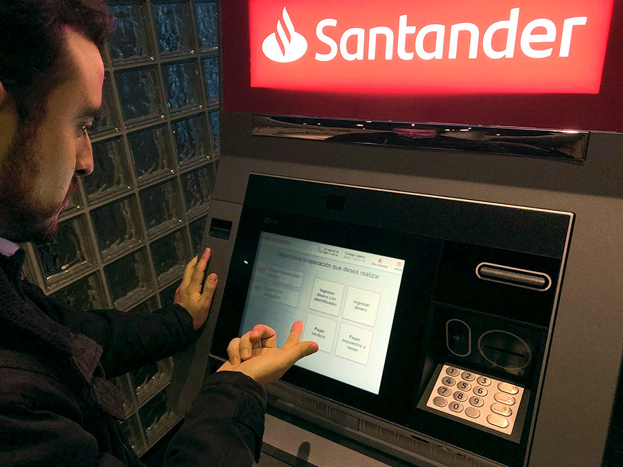
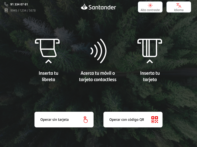
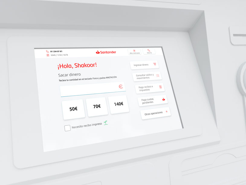
In 2018, Banco Santander decided to refresh the look of its ATMs and trusted Redsys’s expertise to carry out the redesign.
Updating the interface of the most widely used ATMs in Spain was a major challenge. Thousands of people would use these interfaces every day.
After more than 10 years without updating the ATM interfaces, the user experience was outdated. However, users were so accustomed to the old interfaces that a radical change could be too disruptive. It was necessary to improve the interface and flows without overwhelming users with an excessively radical change.
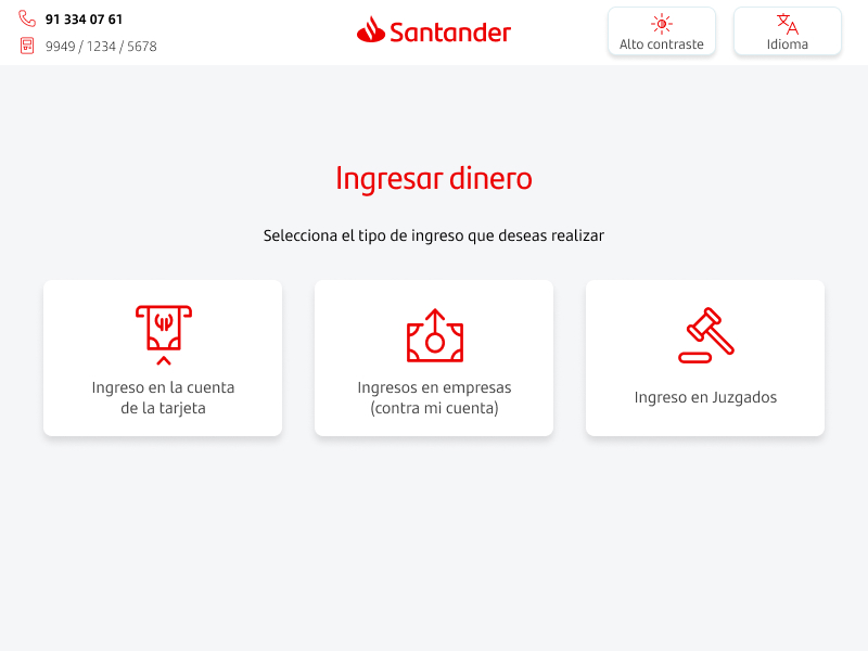
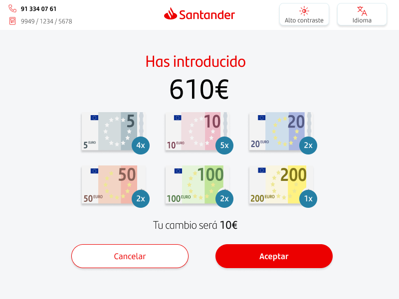
Although the new interfaces ended up being very different from the old ones, the flows changed only as much as needed to improve and speed up the process. User tests showed that, because it’s a simple and repetitive operation, the interfaces could differ significantly from the previous ones.

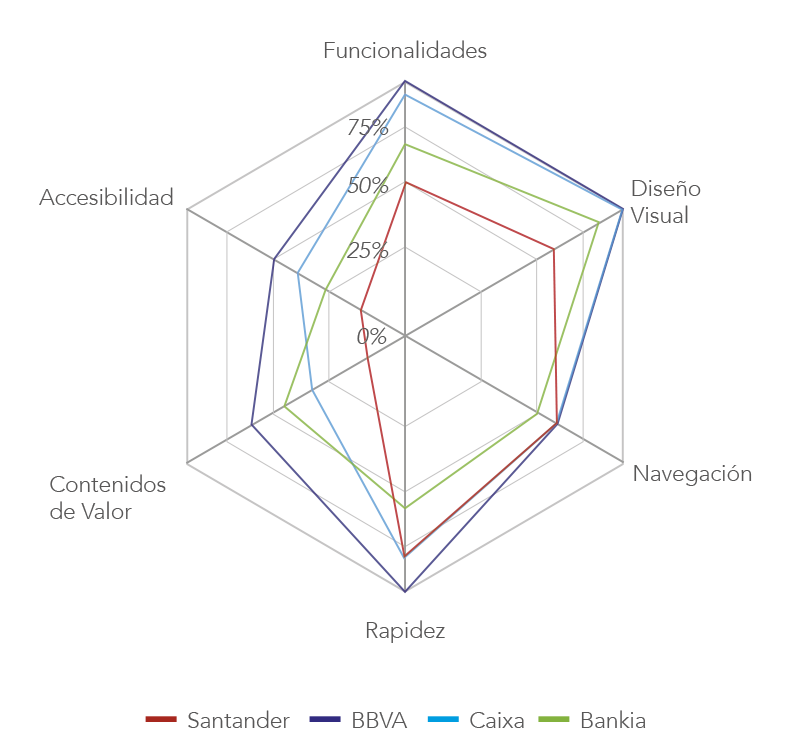
I conducted research and analyzed the market and competitors to position us strategically, seizing innovation opportunities and adopting best practices for the most basic, indispensable features that are vital in the use of ATMs.
I also handled the interaction design, worked with Banco Santander’s UX team to define iconography and final operation flows, and even implemented part of the interface using web technology.
of Spaniards between 20 and 65 use an ATM at least once a week
Spain is the second country in the world with the most ATMs per person
of total ATM usage is for withdrawing cash
To extract our requirements, we compared competitors’ features (visual design, navigation, speed, accessibility, …). This way we isolated each bank’s strengths and weaknesses.
After the research phase we concluded the experience had to:
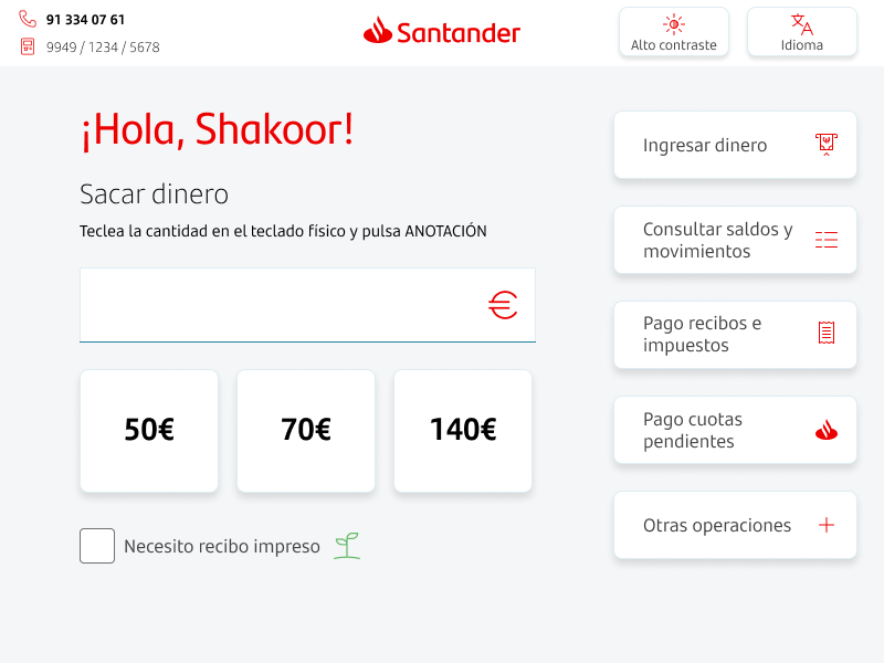
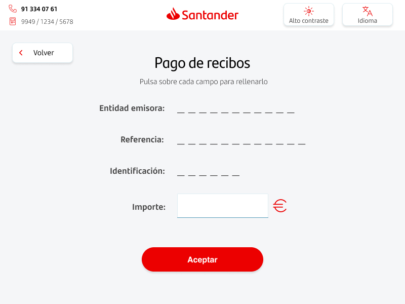
Cash withdrawal is the most important feature for all banks and the one most used by customers. We decided to give it the highest prominence in the interface.
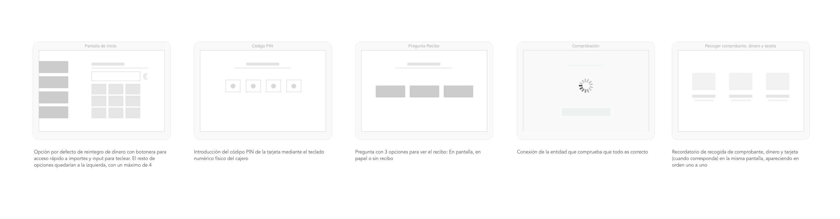
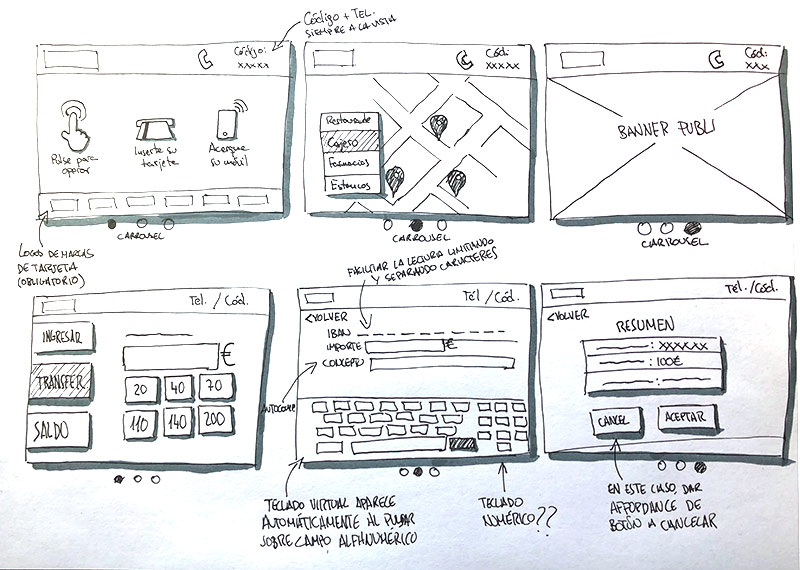
In user tests we demonstrated that small changes in the flow could improve timing for some operations. For most users this was crucial—they wanted to spend as little time as possible in front of the ATM screen.
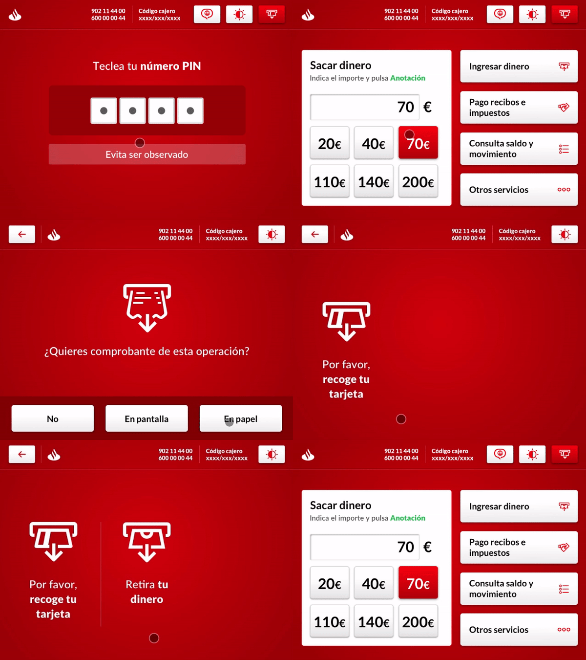
Cash withdrawal flow
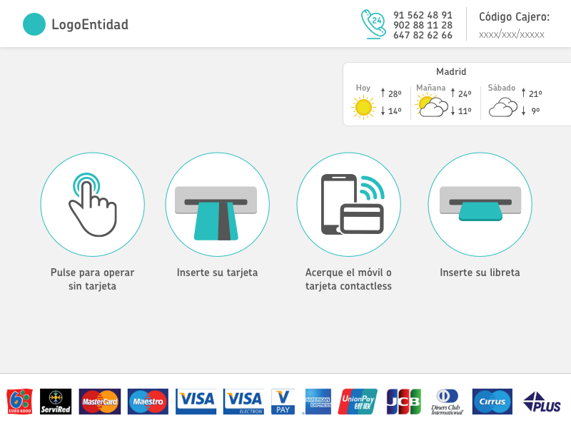
The look & feel of the interface was designed to be customized by any bank, fostering its evolution.
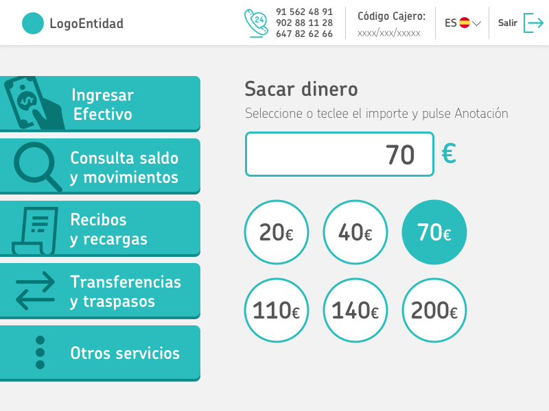
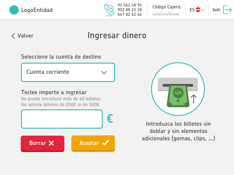
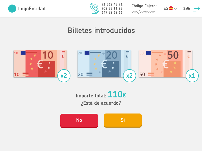
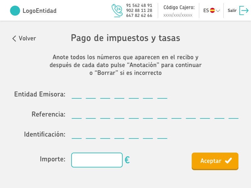


Redsys handles a great deal of valuable information about financial transactions, so we envisioned a product that would offer this information through an interface.
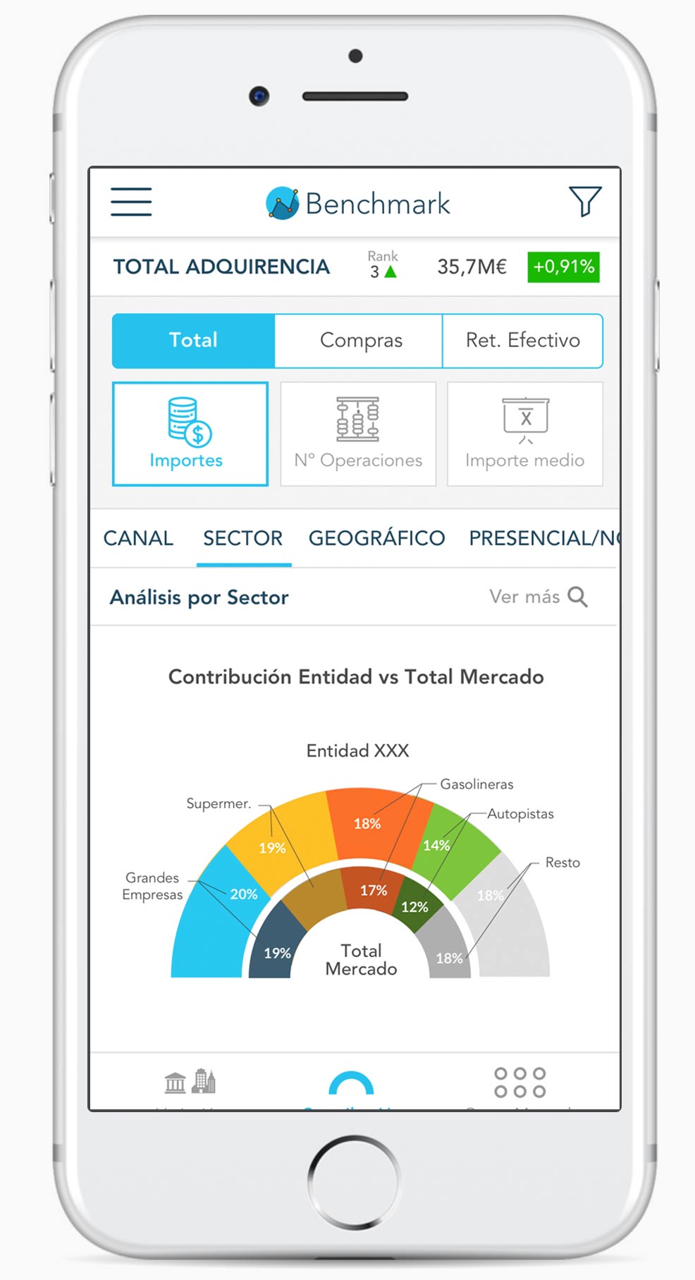
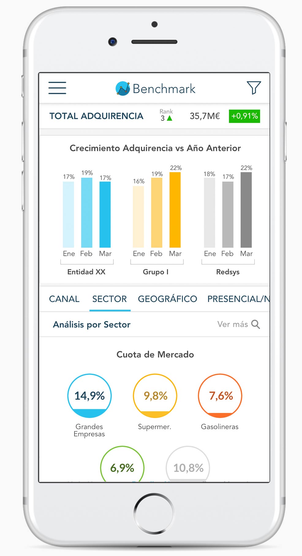
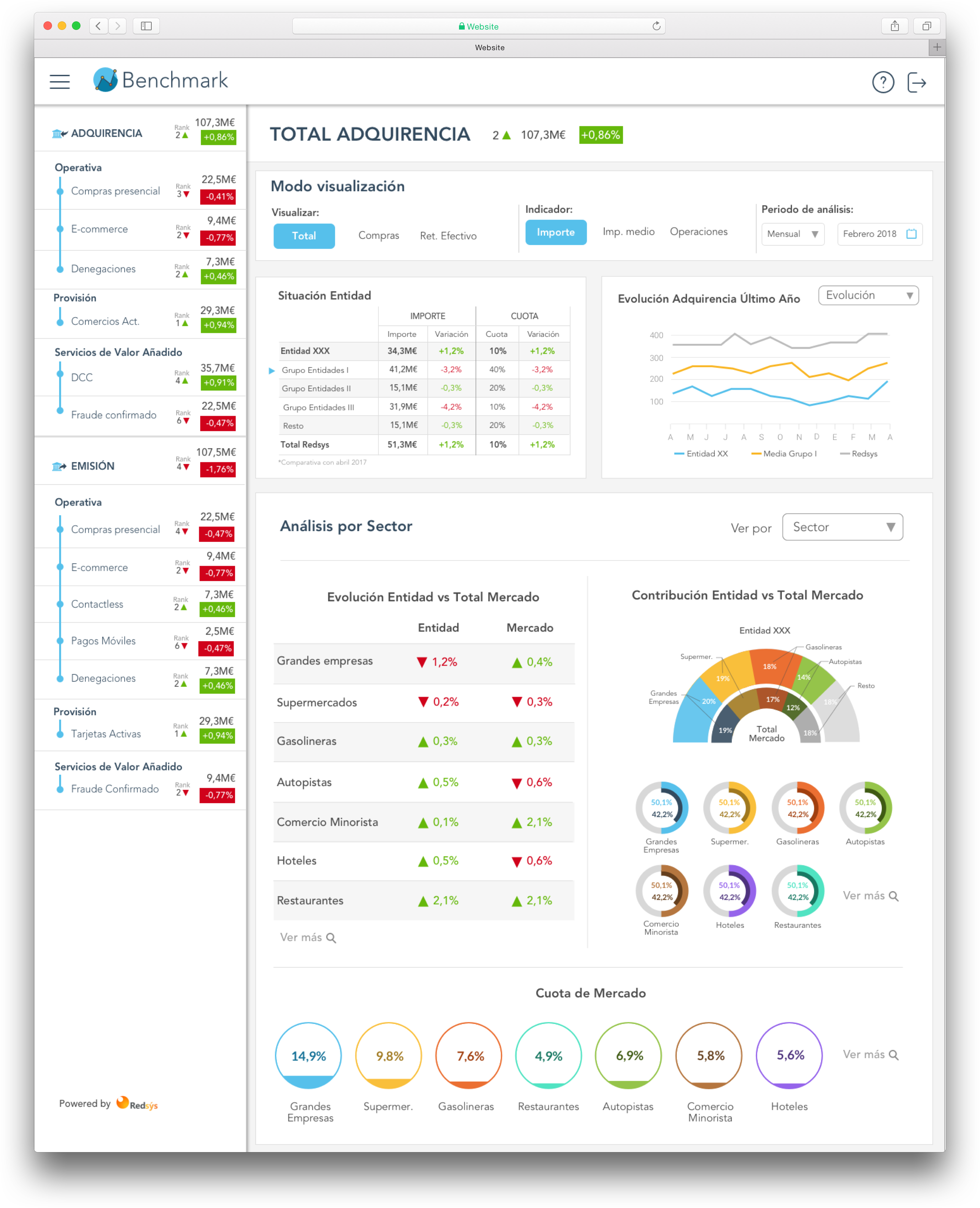
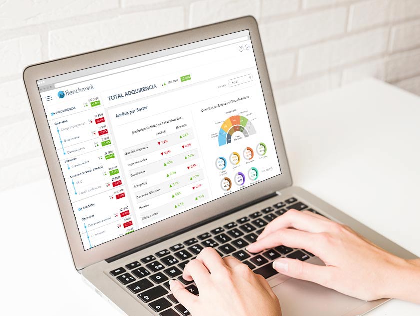
The banks (BBVA, Caixa, Santander, ING, Sabadell…) wanted to understand their position relative to the others, so we designed a benchmarking application. The end user would be an advanced user familiar with banking data, but the sheer amount of data was very chaotic and had to be organized somehow.
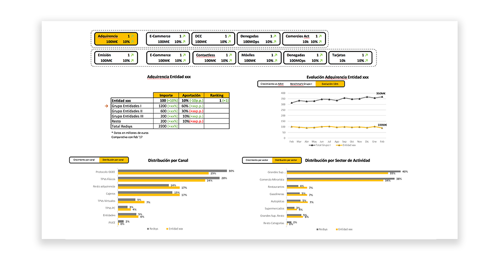
There was a huge amount of information that needed to be displayed as simply as possible. We wanted to give banks the ability to compare themselves against each other in a reference application.
I took part in the entire UX process: research, UI design, interaction design, and front-end implementation.
The first task was to make sense of such a large amount of data. I needed to know what was truly relevant and what wasn’t—what was essential for the user and what we could do without.
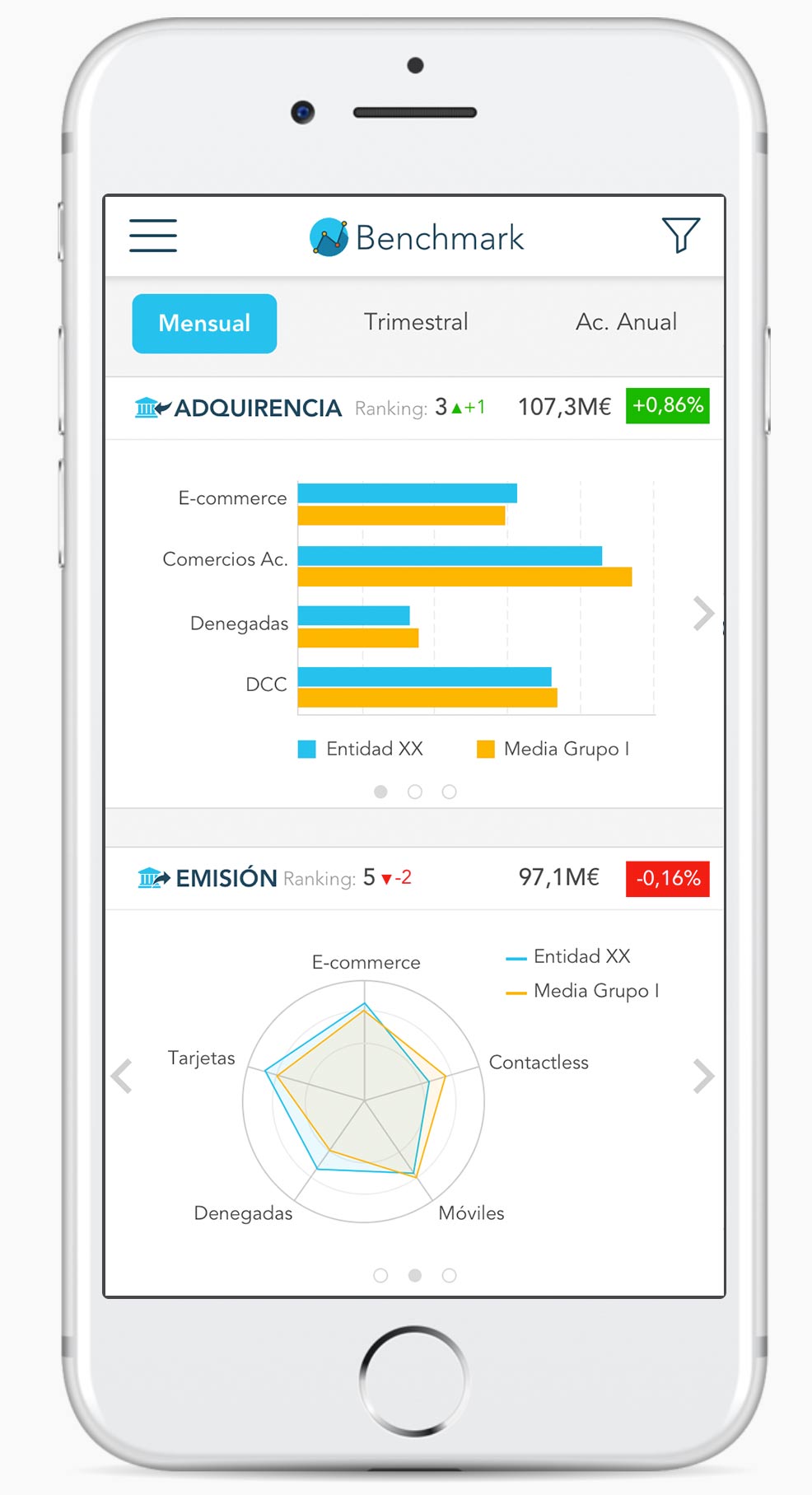
Once the information was filtered, we needed to present it graphically, choosing which chart to use in each case and organizing the data.
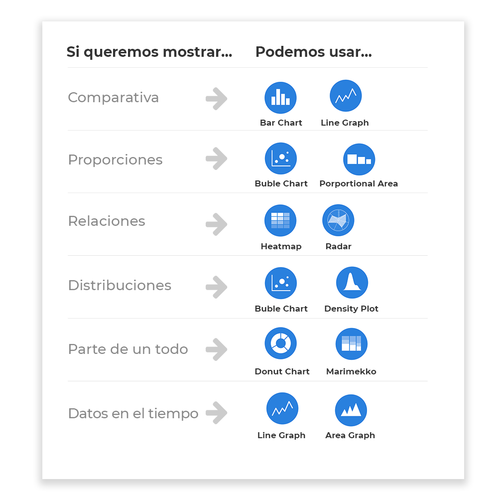
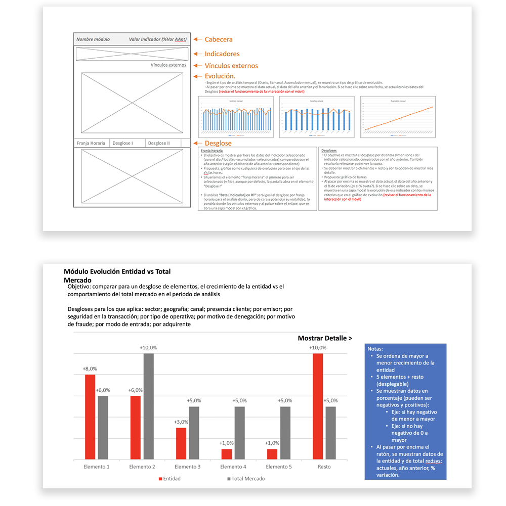
The information architecture was somewhat complex to understand even for users accustomed to banking terminology. We used card sorting techniques and low-fi prototypes for testing.
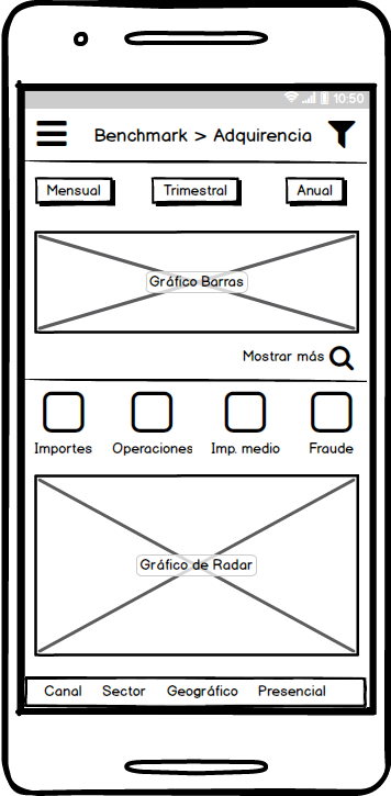
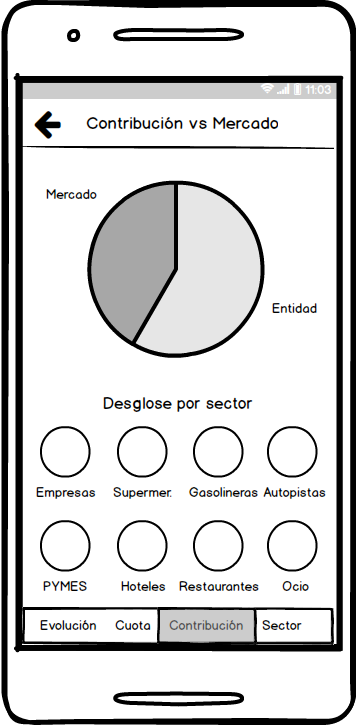
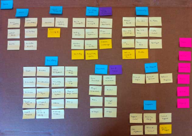
The final solution was designed mobile-first, even though the expected usage split was 50/50 between desktop and mobile devices. The challenge was to simplify such an amount of data; it was “easier” to compress it first for mobile and then bring it to the desktop version.
.jpg)

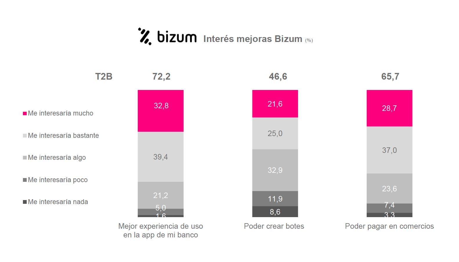
After becoming the most widely used app for person-to-person payments in Spain, Bizum wanted to take the leap to online payments in e-commerce.
There are many competitors in online payments, so we had to differentiate ourselves somehow. The key was the mobile phone, since users knew Bizum from using it in the mobile app. My challenge was to make it easier than typing credit card digits and even easier than using a username and password.
.gif)
First prototype vs final version
I took part in the entire UX process except for user testing (research, visual design, interaction design, and front-end). I especially enjoyed innovating in the checkout flow, achieving a balance between security and ease of use.
A year before going to market, a first prototype was designed, but user tests showed it was somewhat confusing, so we were tasked with solving the problem.
Even before an initial research phase, someone thought that entering a 4-digit code generated by the bank and provided to the user would be a good idea to speed up checkout. However, tests showed that users who already used the Bizum app had no idea what the “Bizum key” was or where it came from.
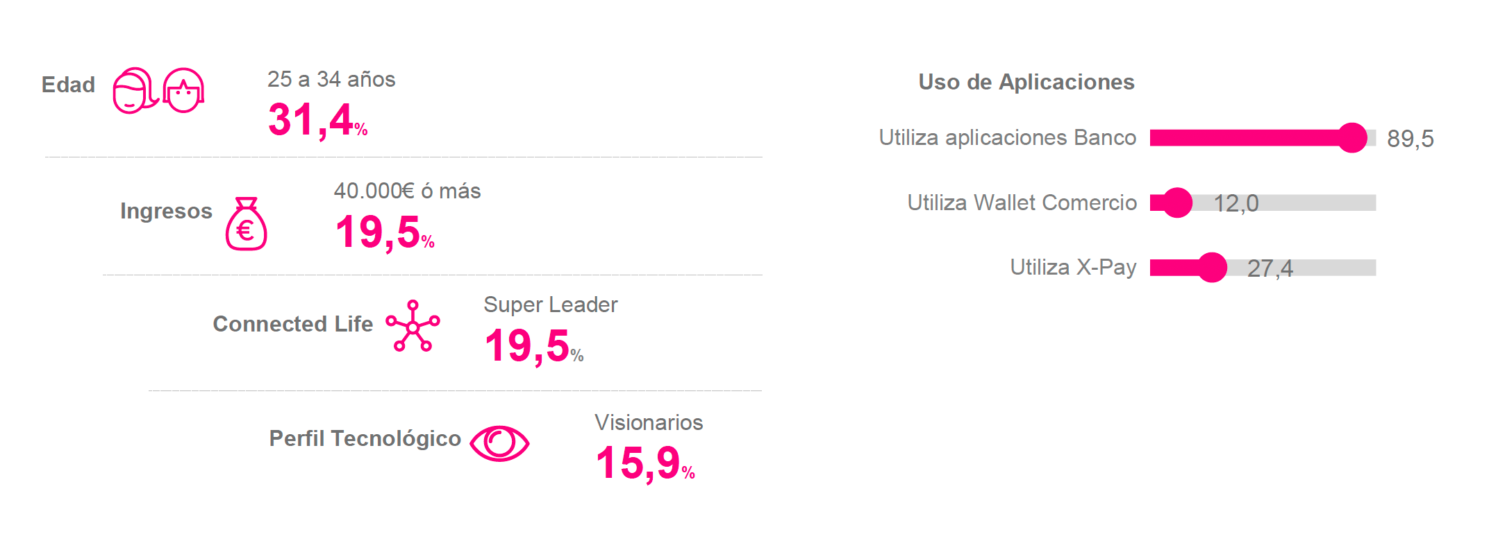
The old interface had quite a few aspects to improve. There were many things that weren’t necessary and only created noise on the screen.
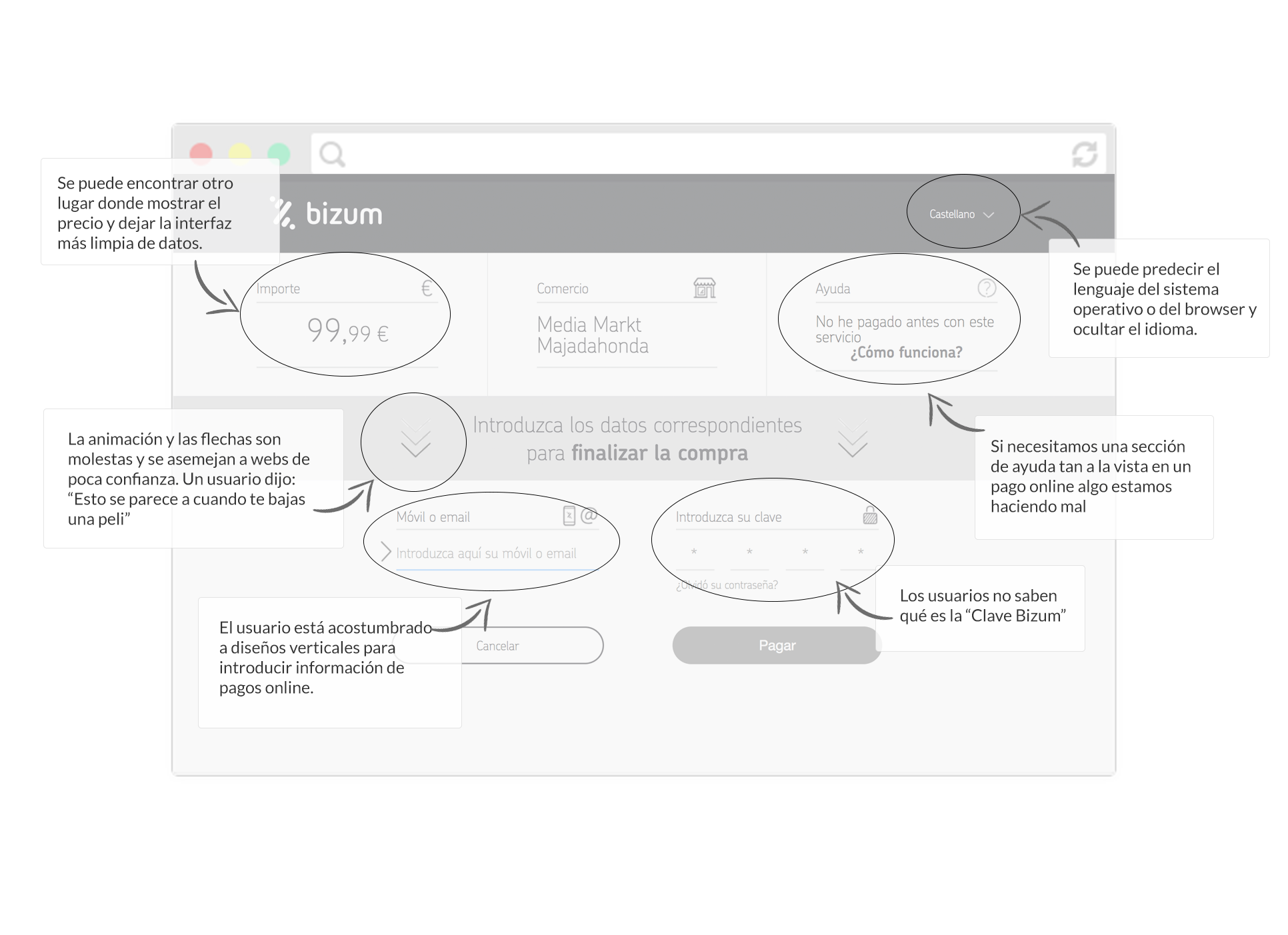
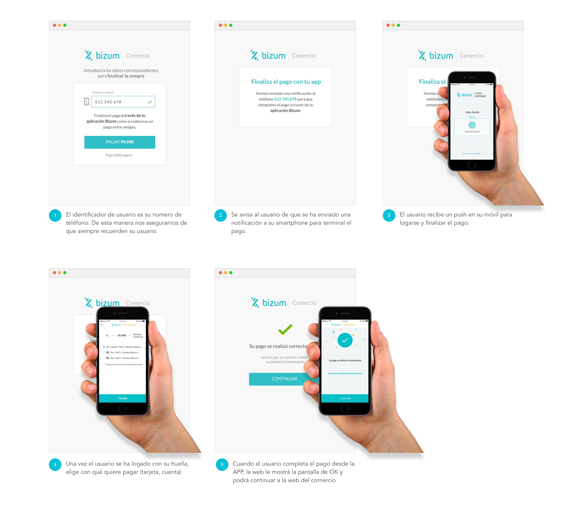
Besides completely changing the structure and look & feel, we needed to address the main entry barrier (Bizum key). We looked for something the user already knew beforehand before starting checkout: their phone number and logging into their app.
.jpg)

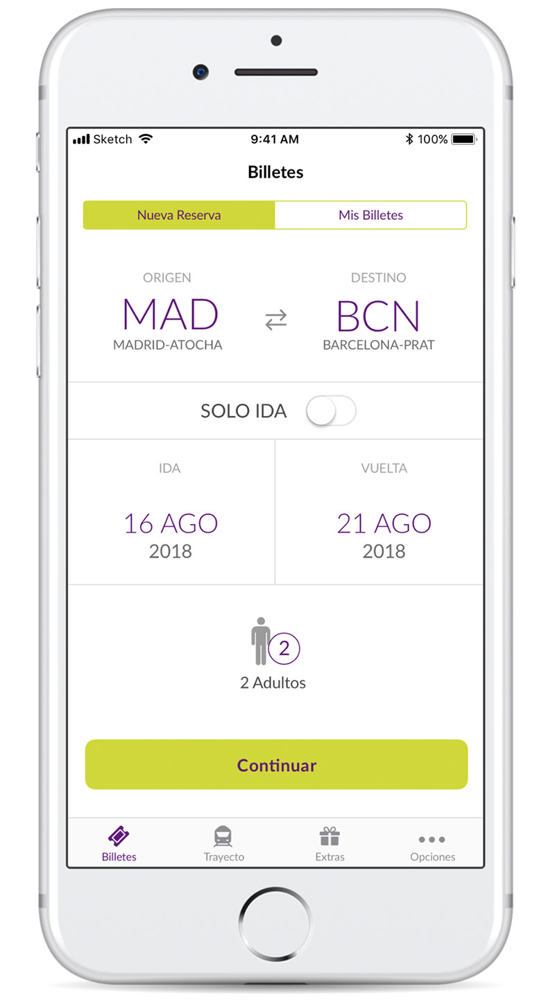
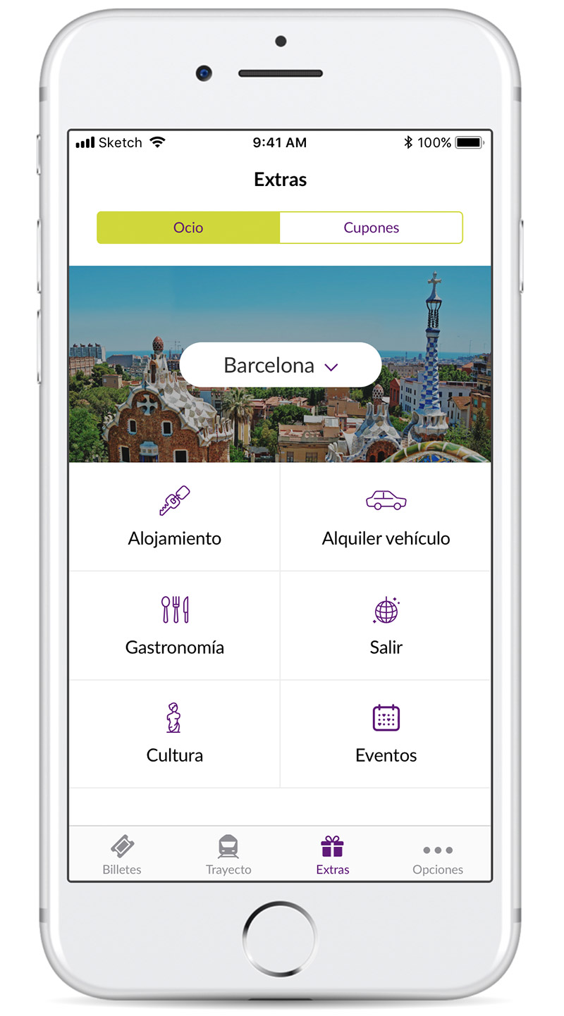
Renfe was launching a new line of trains parallel to AVE, but in this case it would be a “low-cost” service. To complete the service, in addition to the web channel, they wanted to launch a new mobile application that would accompany the user from booking their tickets to arriving at their destination city.
The main challenge we faced was getting to know their customers in order to offer solutions to their needs, making those solutions integrate seamlessly into their usual services. Simplicity had to be the main axis of EVA’s digital experience, allowing customers, through a simple, agile and intuitive interface, to access useful, valuable services before, during and after their trip, fostering loyalty to the service provided.
After the research phase carried out by my teammates, I joined the initial concept ideation phases; later I rejoined the project to fully develop the app’s interaction design.
We analyzed, deconstructed and organized the data collected during the exploratory research phase and produced outputs using Buyer Persona and Customer Journey techniques.
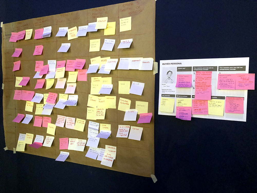
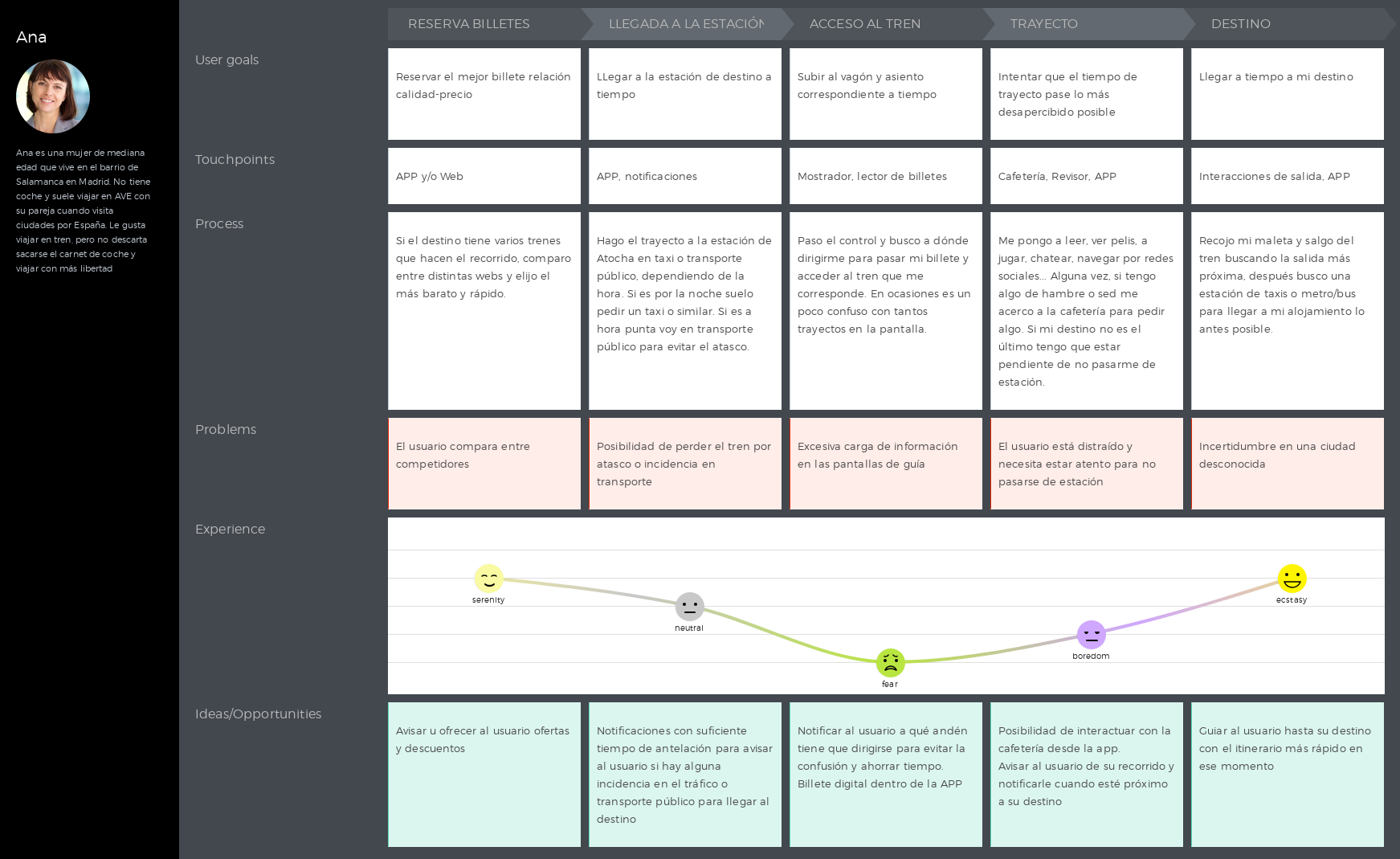
The most important step is starting your ticket booking, and this is where everything must be as easy and versatile as possible. After researching competitors and users, we arrived at a set of key questions to solve: Can I

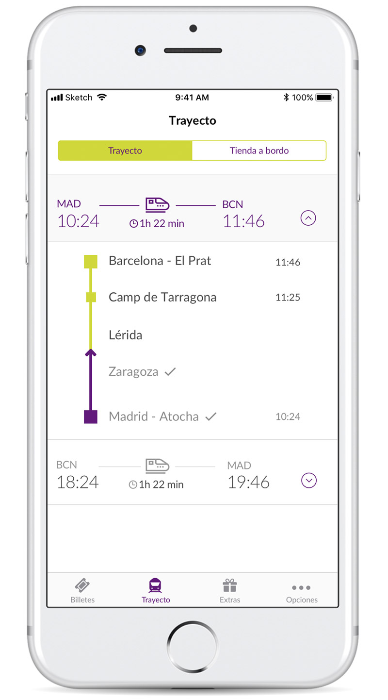
One big difference compared to other means of transport is the importance of journey information. Where am I now? How long is left until I reach my destination? What are the next stops before I arrive? Has there been any incident? Am I on time?
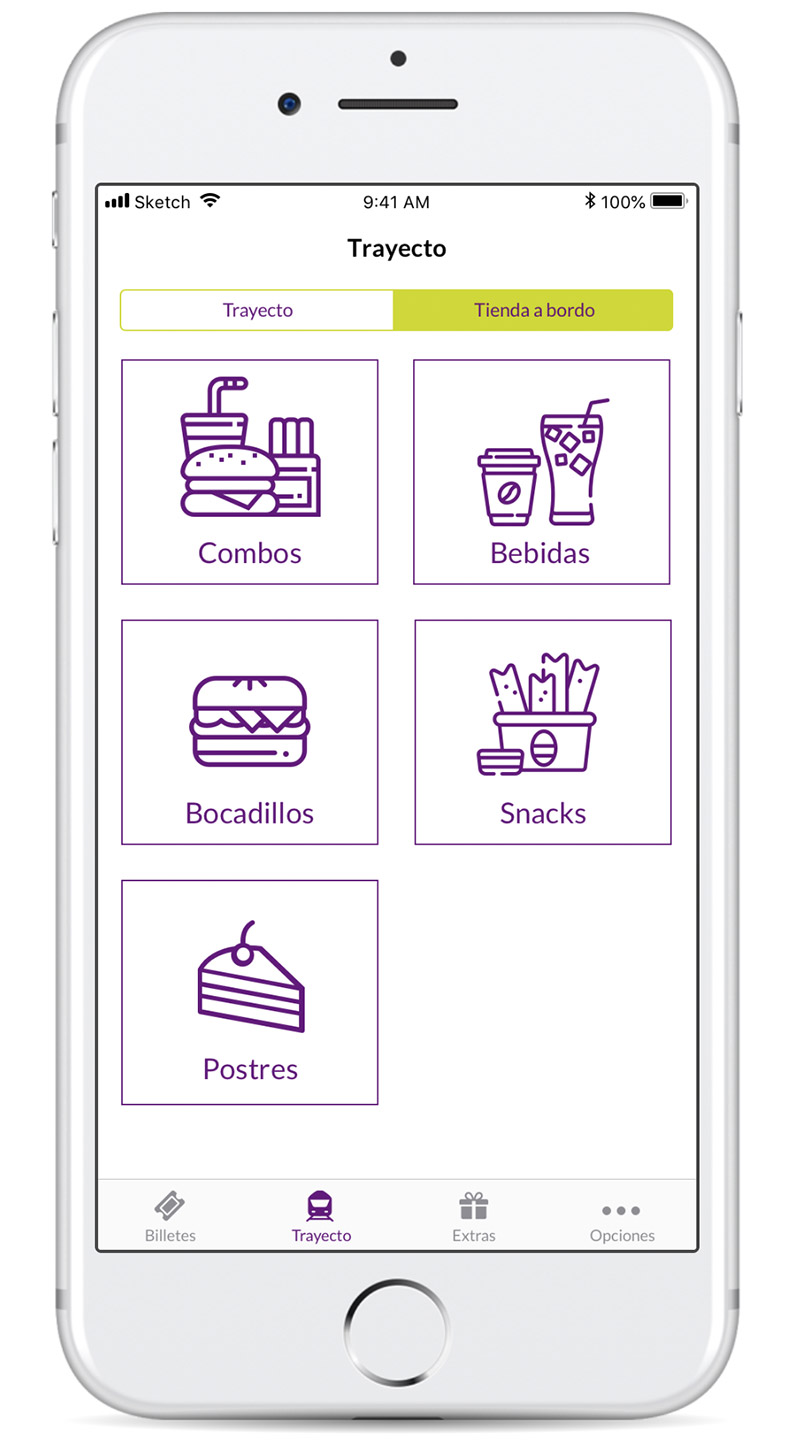
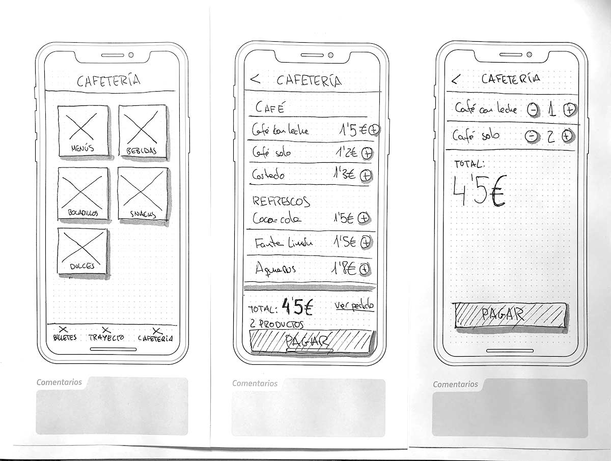
Having a coffee, breakfast, buying a magazine, etc. are processes with a single objective: get a product. What better than to bring the online experience onto your journey. Buy these products from your phone, from your seat, and when they’re ready, just go pick them up and enjoy them on your trip—or receive them at your seat.
.jpg)
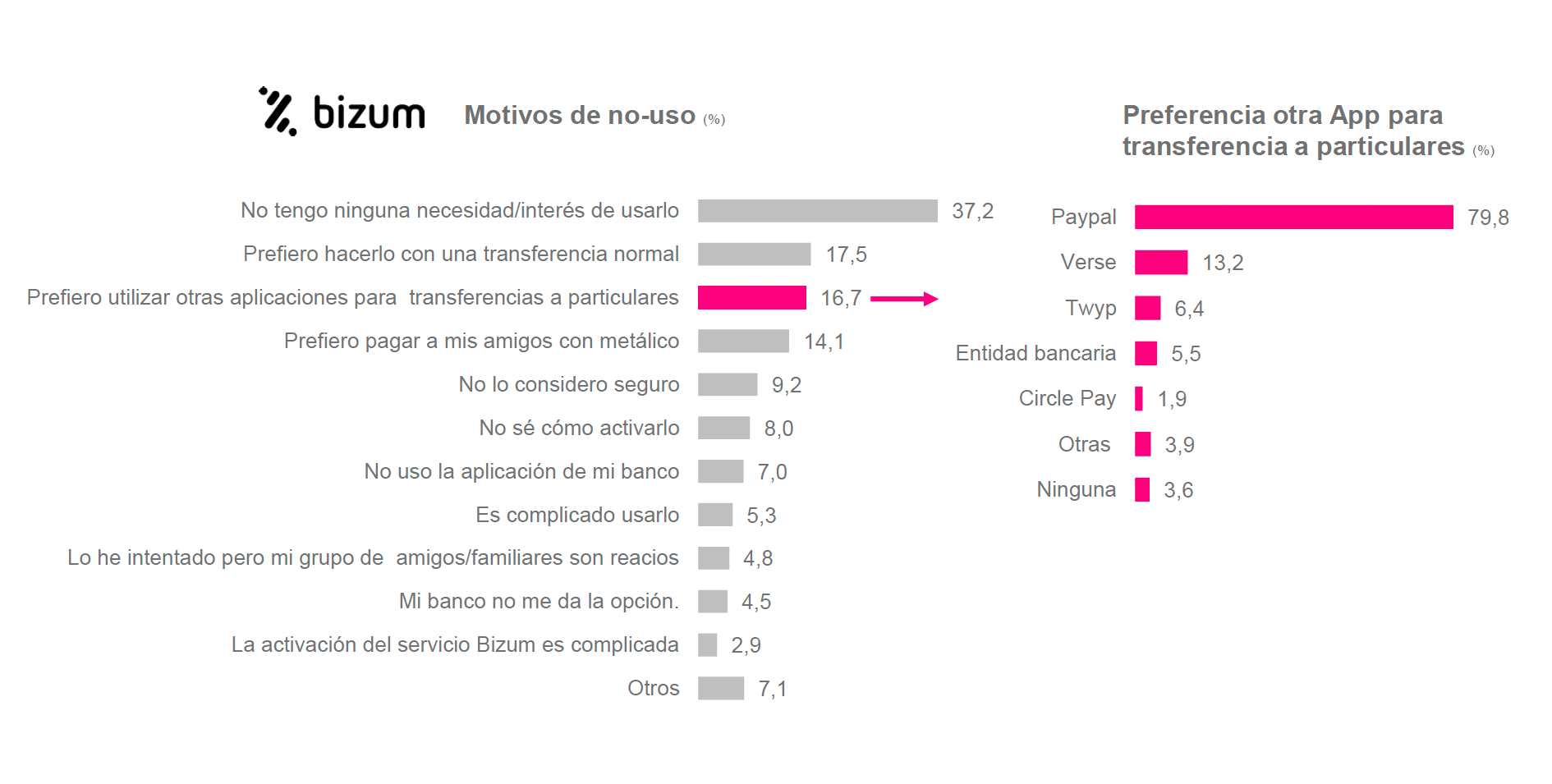
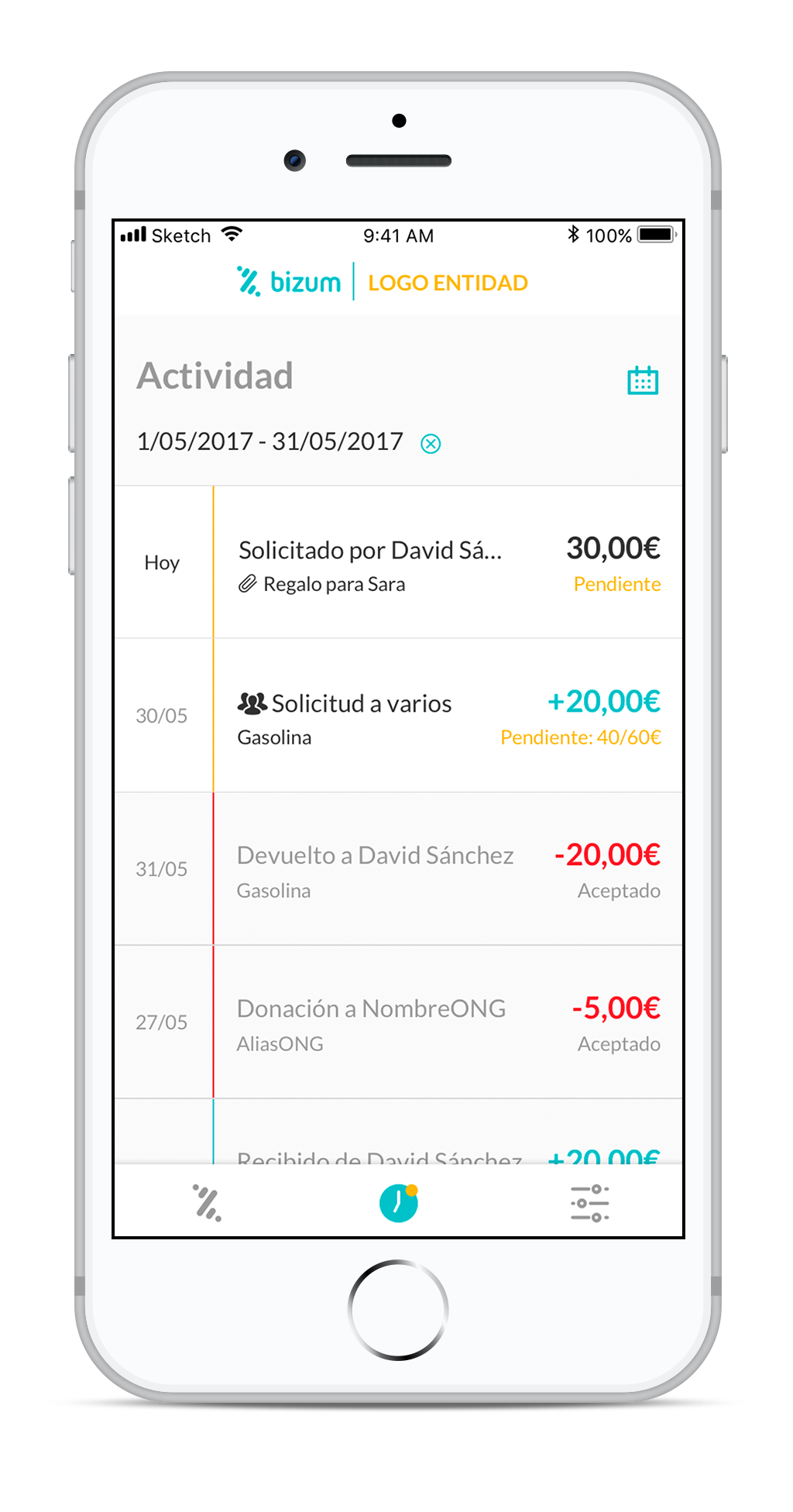
Banks wanted a new app where users could make small transfers between friends and pay in stores with their phones.
At a time when banking is going digital, making a difference by creating an app is quite a challenge. We had to translate complex banking language into a simple, lightweight interface.
I did the UI design and interaction design for different banks. My task was to create prototypes that could fit the brand of any bank.
.png)
70% Used online banking in the last year
32% Have never set foot in a bank branch
62% Use banking apps on their phone or tablet
45% Use mobile-only banking
68% Think money management will be different in 5 years
70% Believe payments will be totally different in 5 years
If the target is millennials
Design should:
Comparison of sign-up process among competitors:
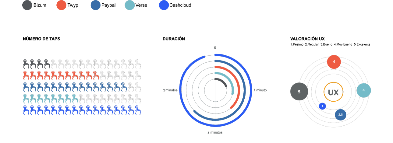
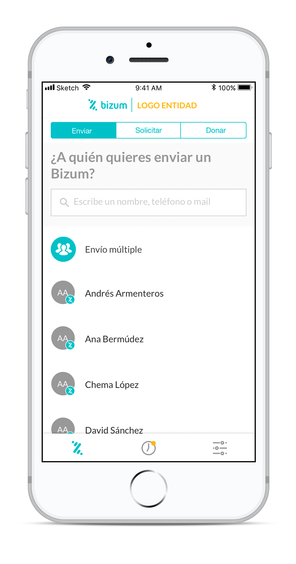
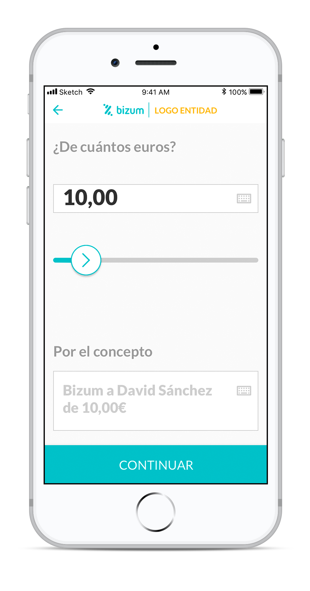
Comparison of money transfer among competitors:
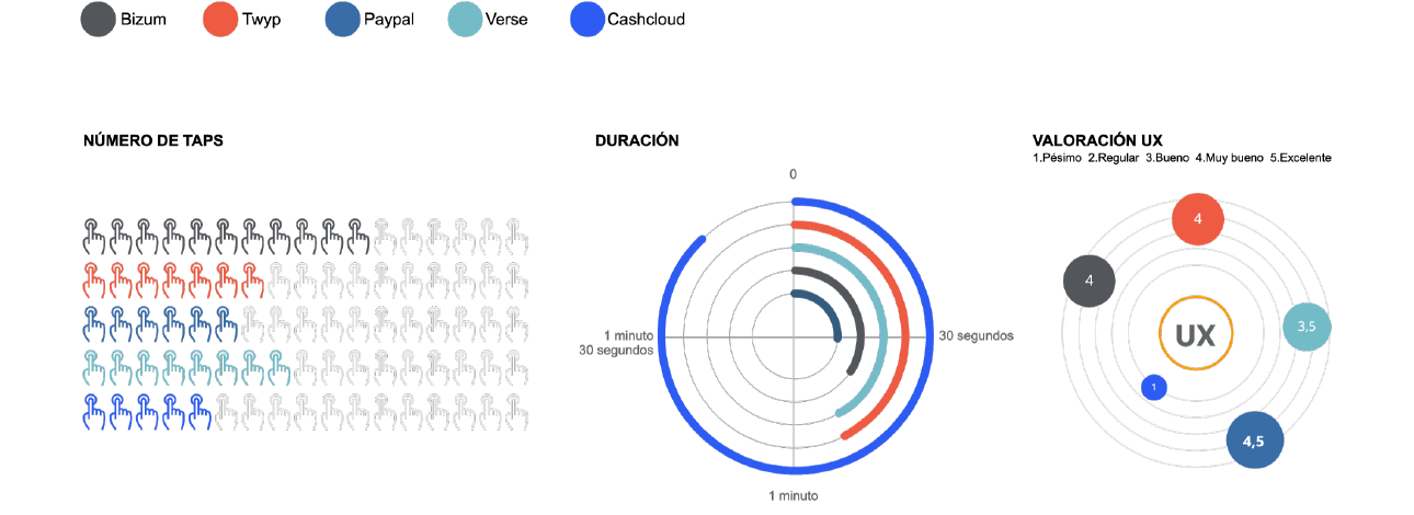
1A sense of security is achieved by ensuring users are aware that data is handled securely by the institution, asking the user to authenticate, and making sure they understand what’s happening at every moment.
2Maximum speed is achieved by surfacing the most used operations and reducing the actions/data required from the user.
3Ease of use requires steps based on familiar concepts, plain language and descriptive icons, so a how-to tutorial isn’t necessary. It also means not overloading the app with features that don’t add value to the core operations.
.png)
.jpg)

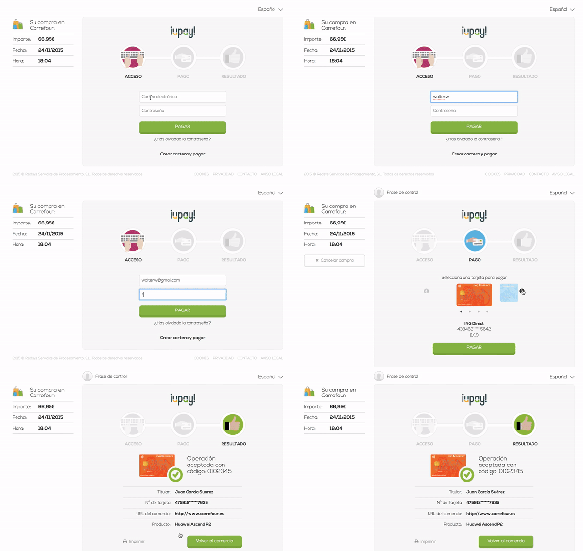
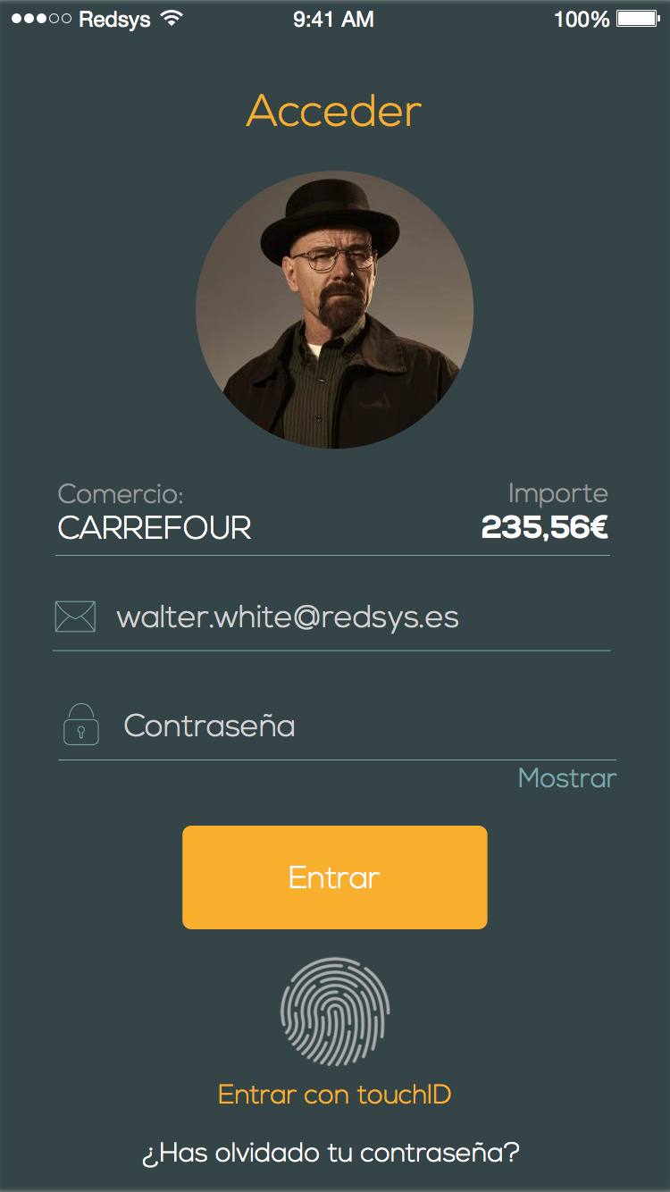
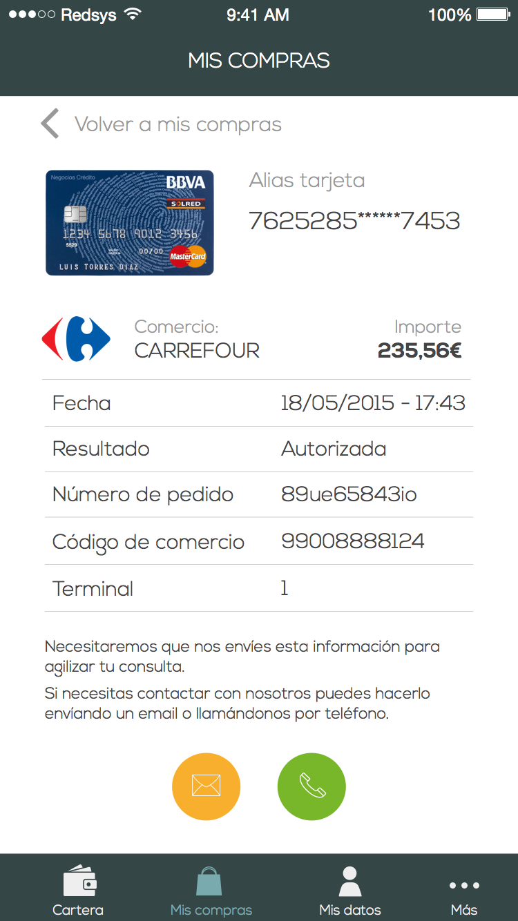
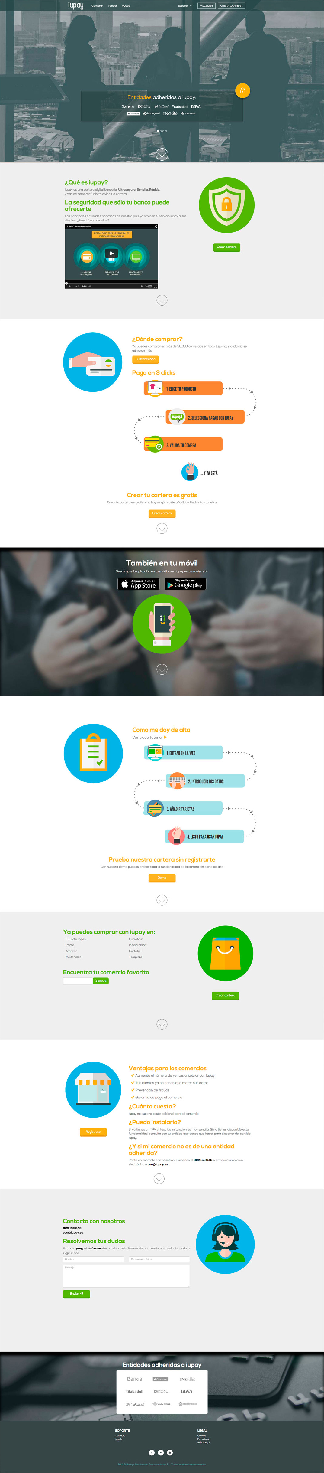
iuPay launched in 2014, but only a few users were using the platform. We needed to attract potential users to make iuPay a national standard for online purchases.
Our goal was to increase the conversion rate, both for new user sign-ups and for completing the checkout process. The biggest difficulty was competing against giants like PayPal, Google Wallet, or Stripe. On our side, we had the backing of the largest banks in Spain.
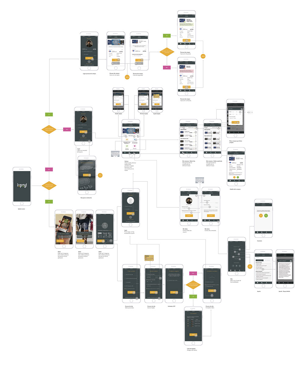
I led the interaction design, UI and front-end implementation for the desktop version and the mobile application. In addition to the payment gateway itself, there were several digital products that completed the service and needed redesigning: public website, wallet management, checkout process, app, sign-up form…
I also carried out some research based on user web analytics for those already using the service.
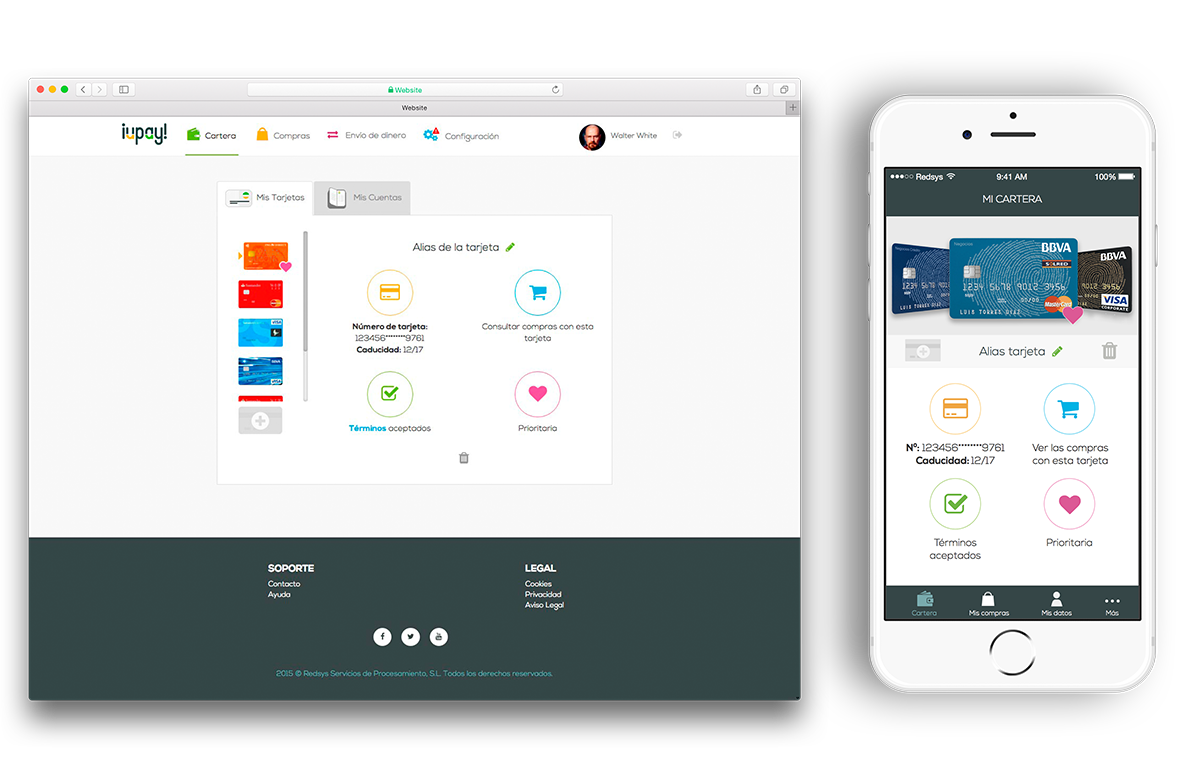
For business reasons, iuPay was launched too quickly, without paying enough attention to the user experience. A year later we were able to join the project and perform a heuristic analysis to solve the most “obvious” problems, but we still needed to understand users’ habits and behaviors.
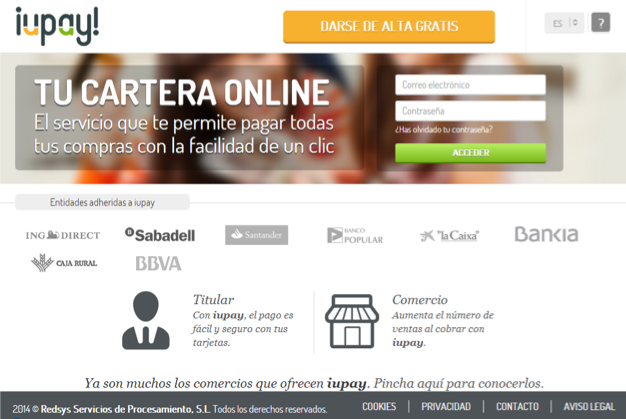
Previous home page
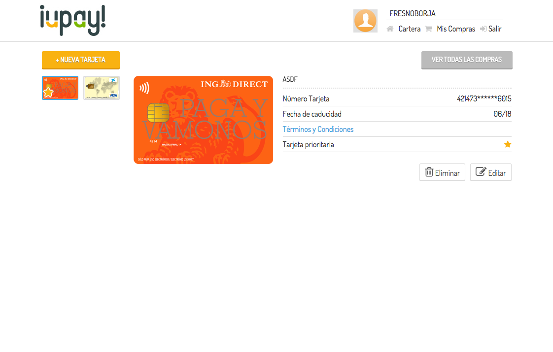
Previous wallet page
We needed to start by optimizing the conversion rate in service enrollment. By keeping only the essential fields in the sign-up form (from 10 to 4 fields) and following general structuring/design principles of heuristic analysis, we streamlined registration and thereby increased the conversion rate during sign-up.
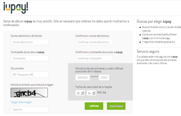
BEFORE
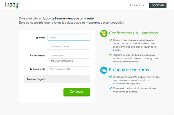
AFTER
Once the registration form was optimized, it was time to update the website, the wallet, the checkout process and the app.
For all these products we carried out a series of creative exercises, one of which consisted of sketching 8 ideas on paper in under 40 minutes using different tools. After one week of sketches and wireframes, we had most of the features defined.
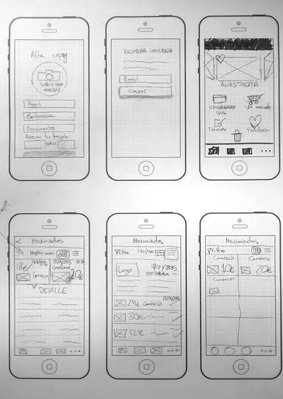
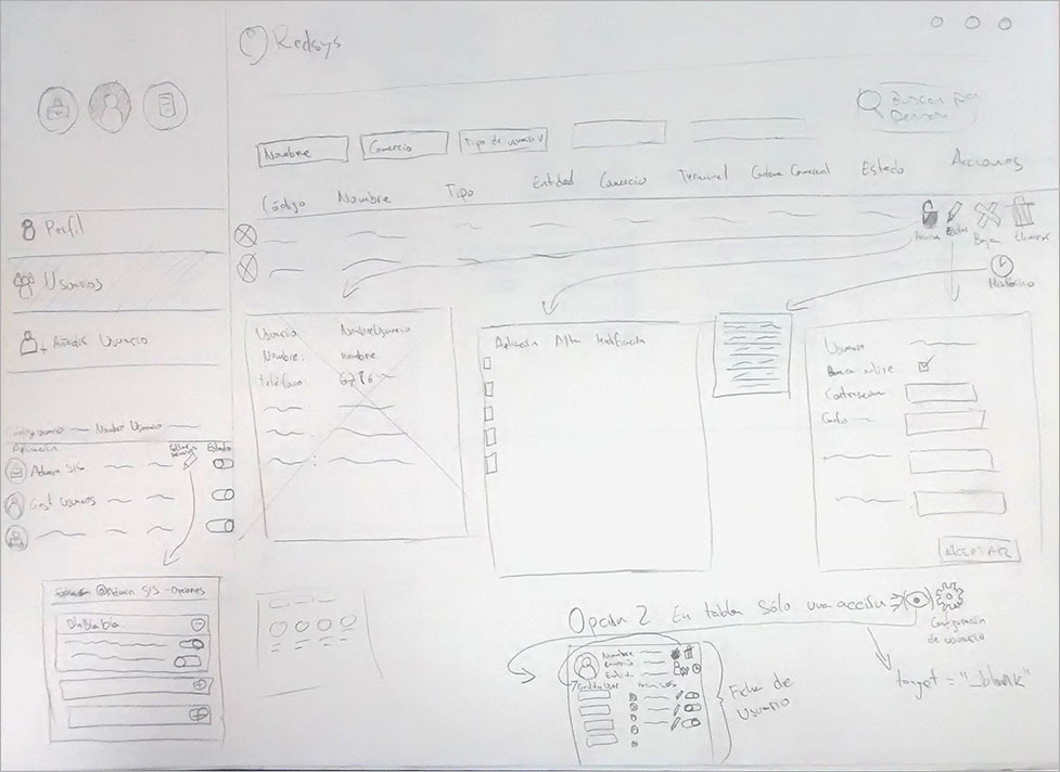
.jpg)
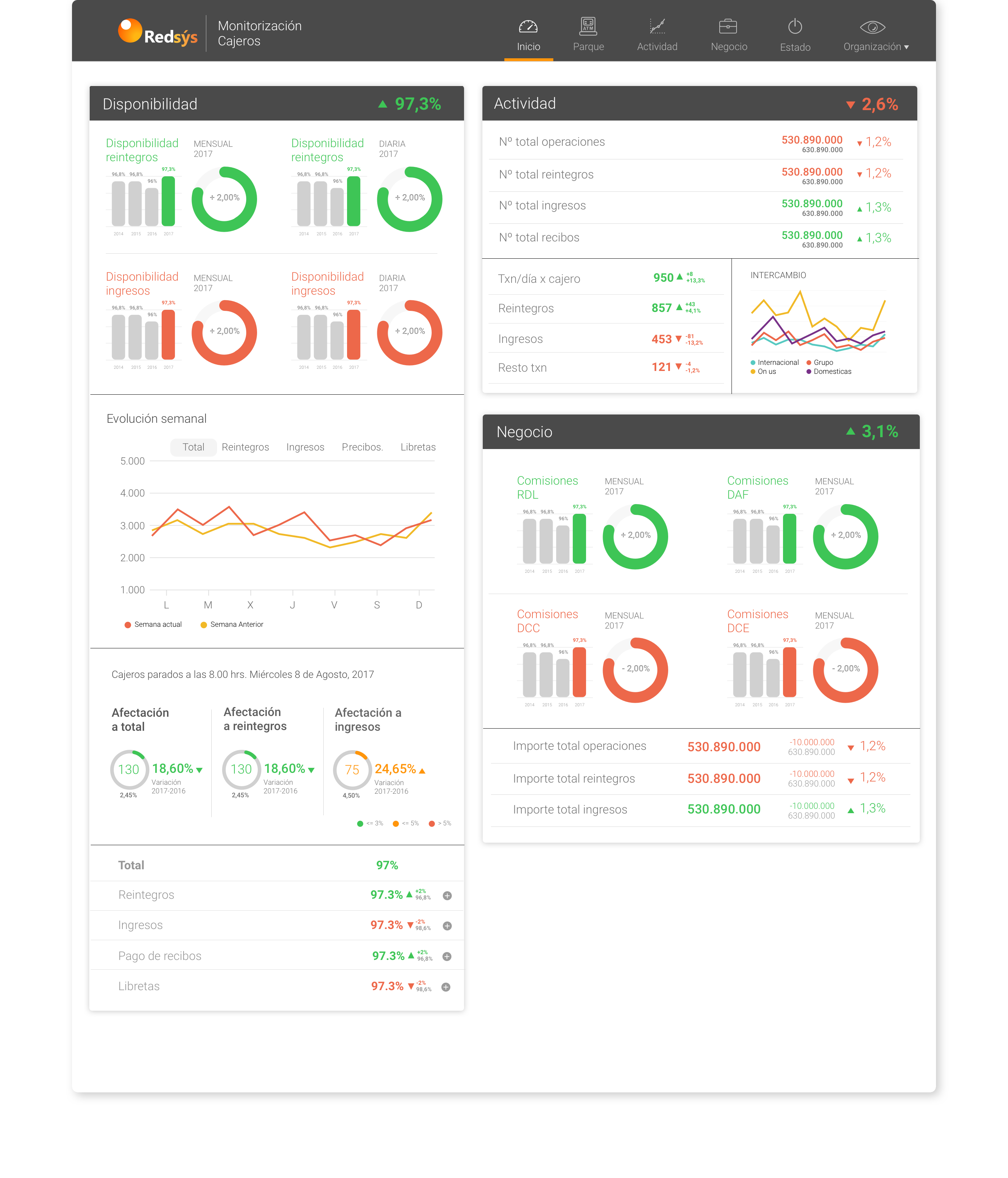
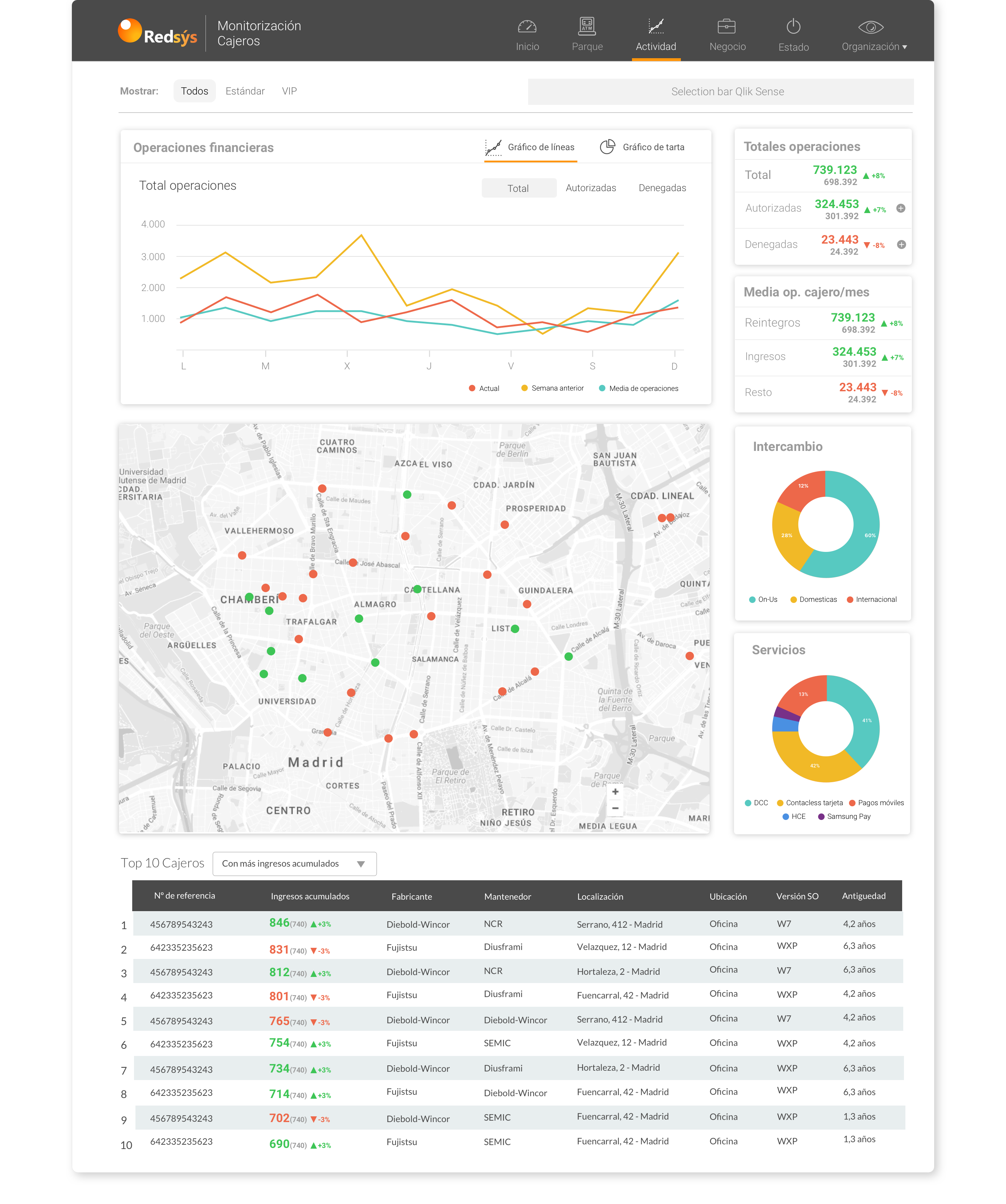
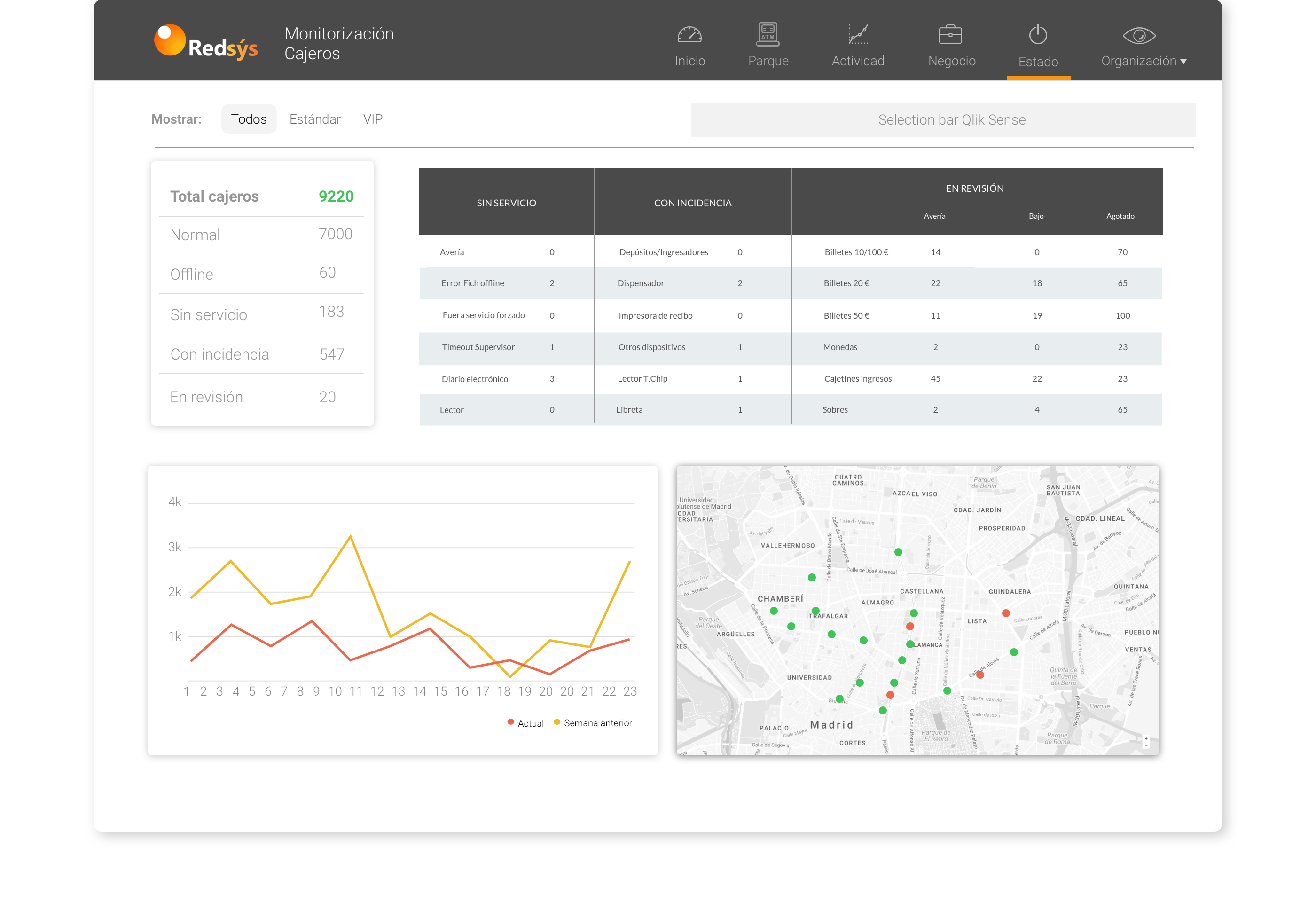
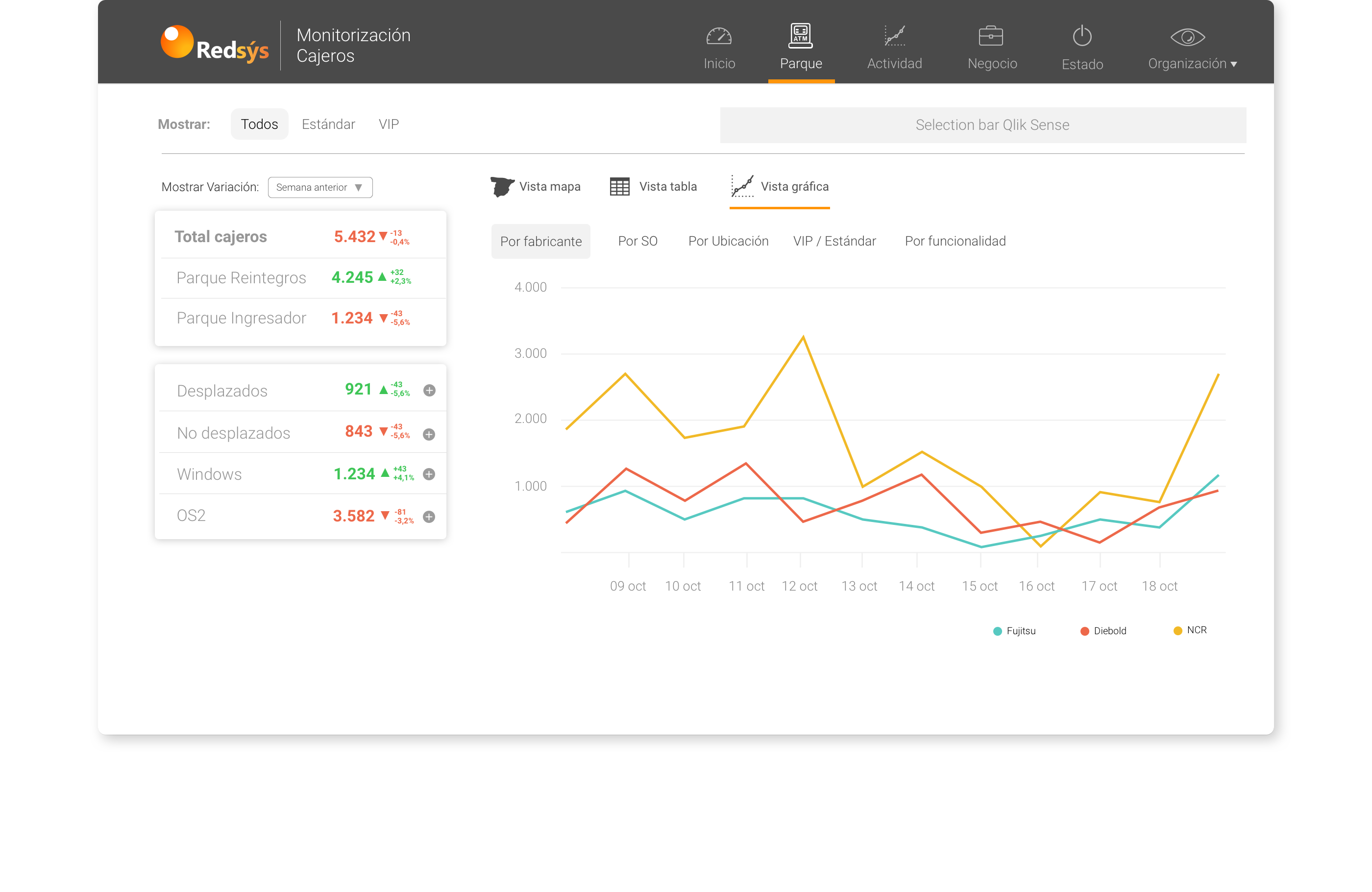
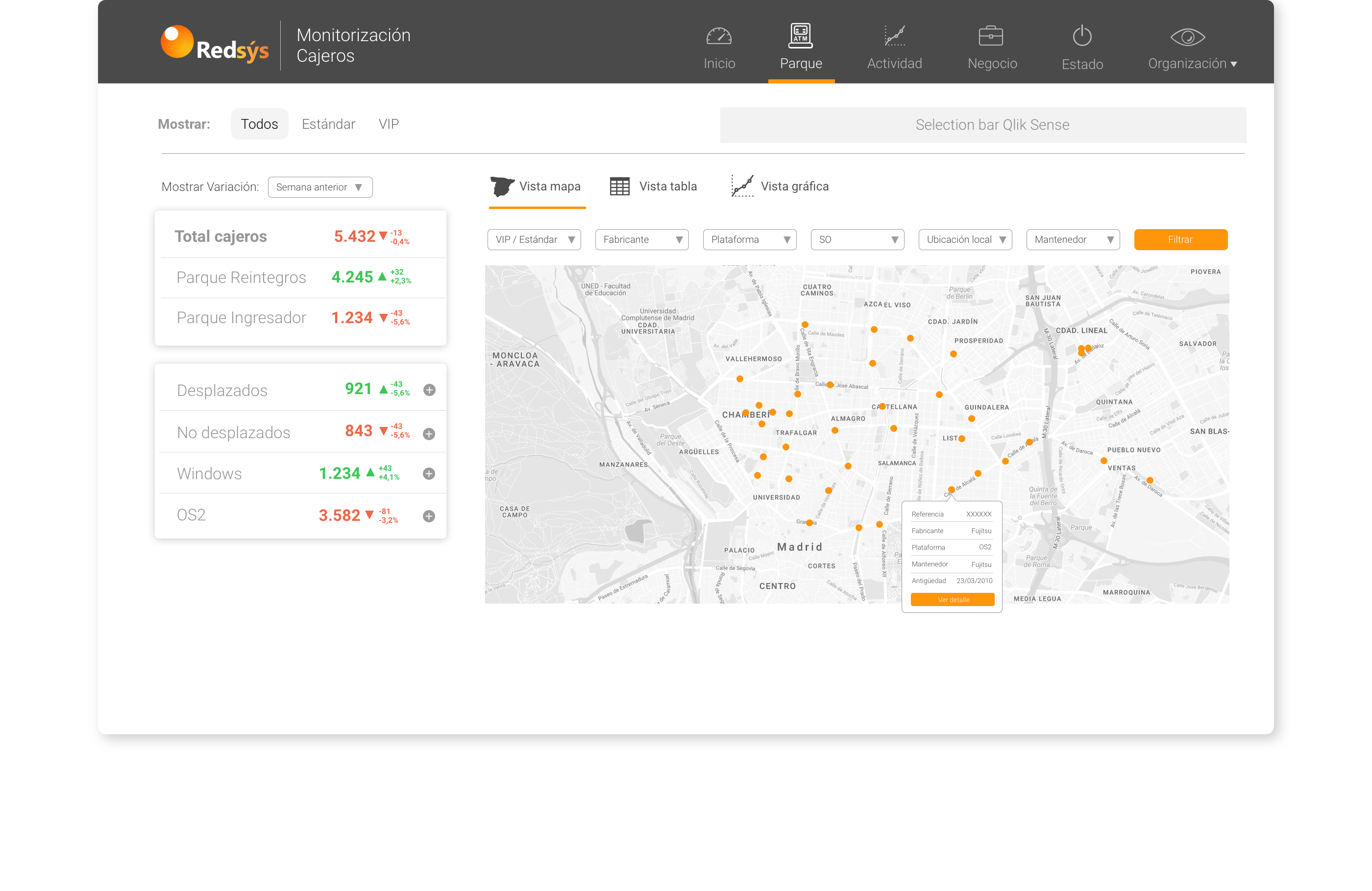
Banco Santander asked us to create a tool to exploit their data and analyze all the information related to their ATMs from both a technical and business perspective.
Hundreds of thousands of transactions are collected by Redsys every day. The job was to filter that valuable information, organize it and shape it into a user interface.
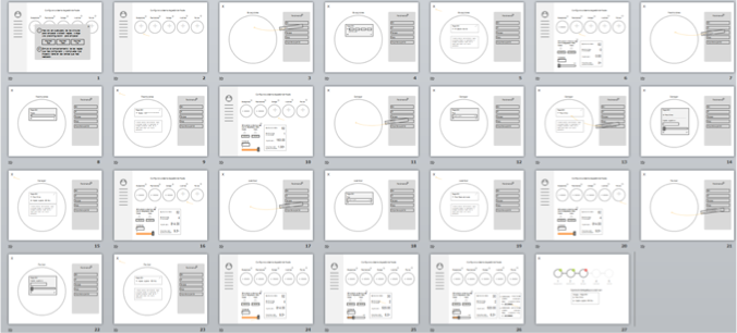
From the UX side, only two people were involved in this project. I was responsible for all the interaction design, visual design and front-end implementation. We jointly handled the wireframing and prototyping phase.
Redsys has almost all the information related to card banking operations, which is why Santander entrusted us with creating a product that could display all this information in a more visual way than the endless Excel tables they were used to handling.
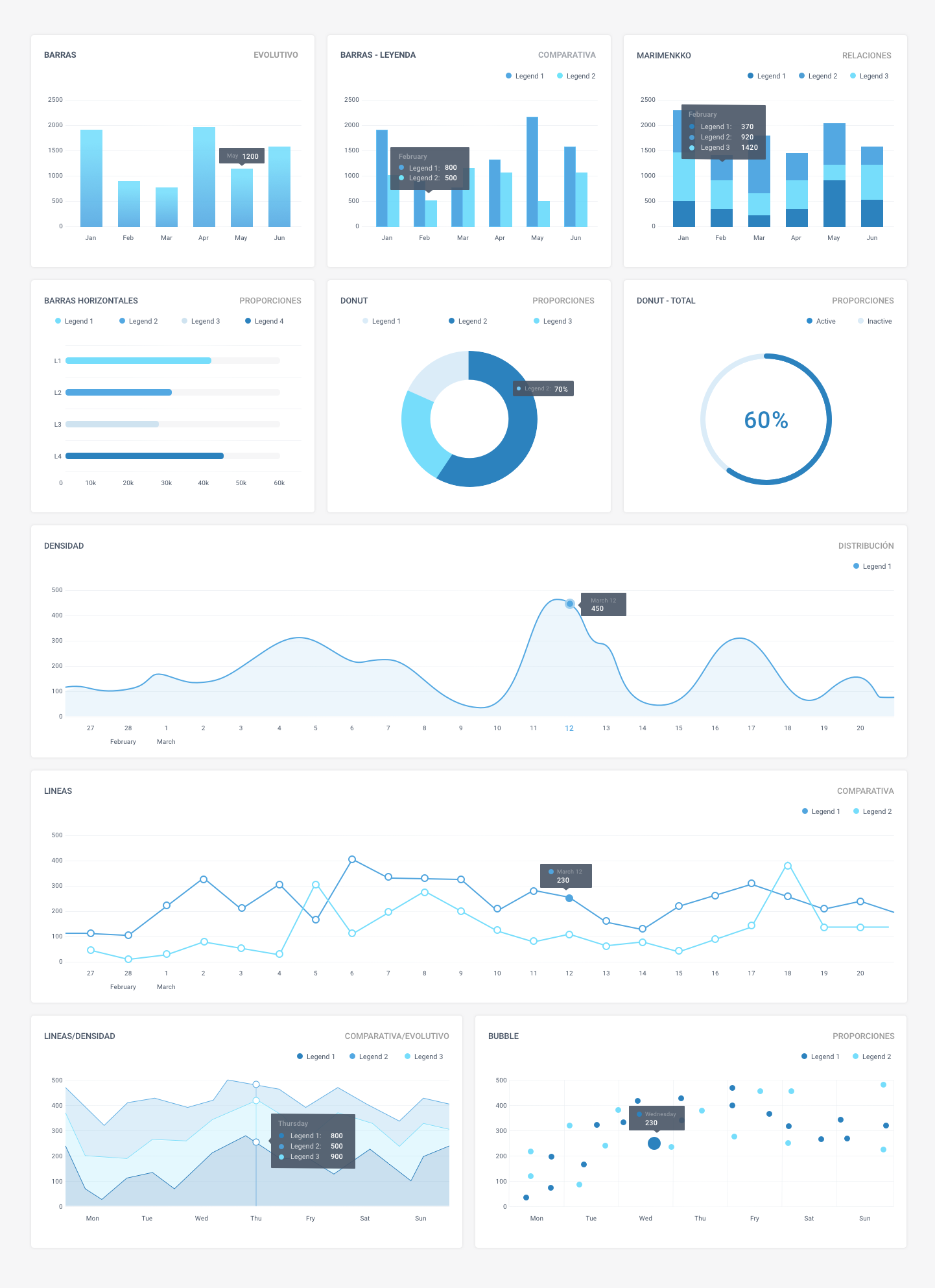
Once the architecture and hierarchies were established, the next step was to turn that volume of data into charts and avoid displaying tables whenever possible.
The final design had to be very sober, since it would be personalized with the corporate image of the corresponding banks.
It was time to update the most-used payment gateway in Spain. Around 200,000 users use this service every day.
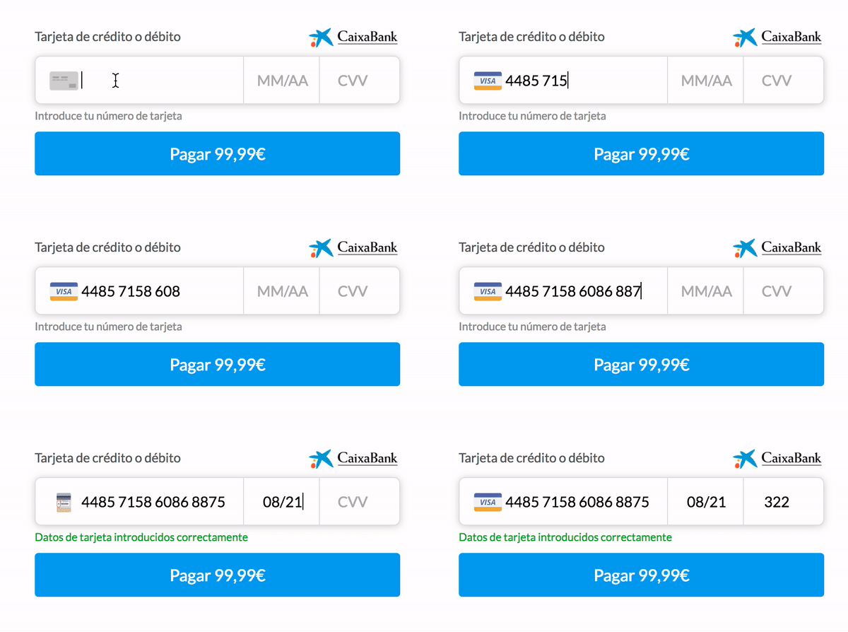
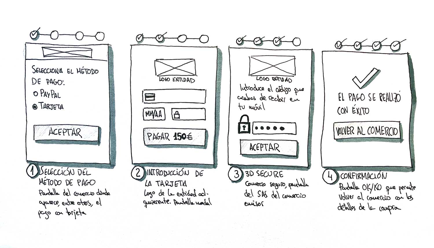
In 2014 the interface was renewed; however, it was only a visual redesign—the structure was the same as 20 years before. There was room to make the process more agile by removing steps and unnecessary information that only created noise and confusion.
Because it was a simple (but very critical) process, I was the entire UX team by myself. I ran a small research phase and did the prototyping and interaction design on my own, with some help for the user testing.
Although it has been booming for years, e-commerce continues to grow and most merchants choose the solution offered by their bank over third-party services like PayPal or Stripe, which charge a fee per sale. Since we had to design a common solution for all banks (ING, Santander, Popular, Caixa, Sabadell, Bankinter…), the design needed to be neutral—our deliverable would be a “white label”.
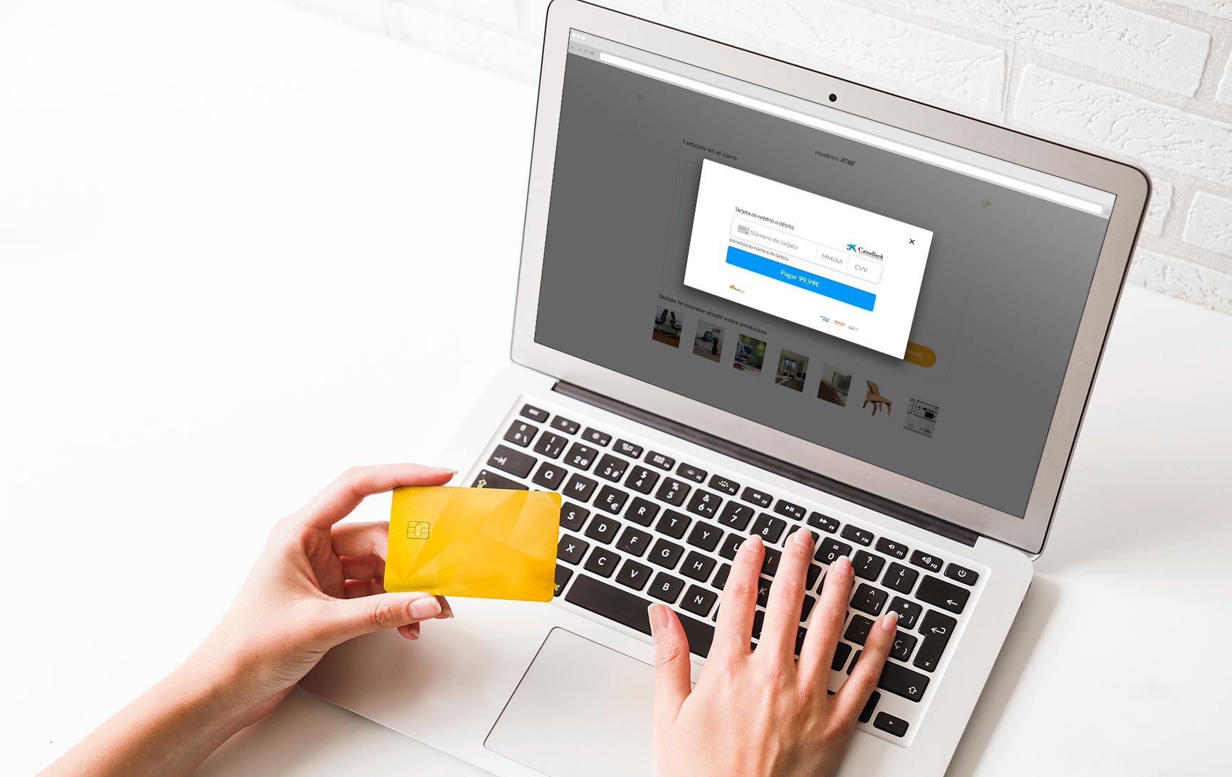
To begin, we had to get rid of everything that wasn’t essential or didn’t add value to the user. User tests showed several elements weren’t necessary if we included the gateway in a modal window within the merchant site. This way the user didn’t lose the sense of navigation and we kept the context.
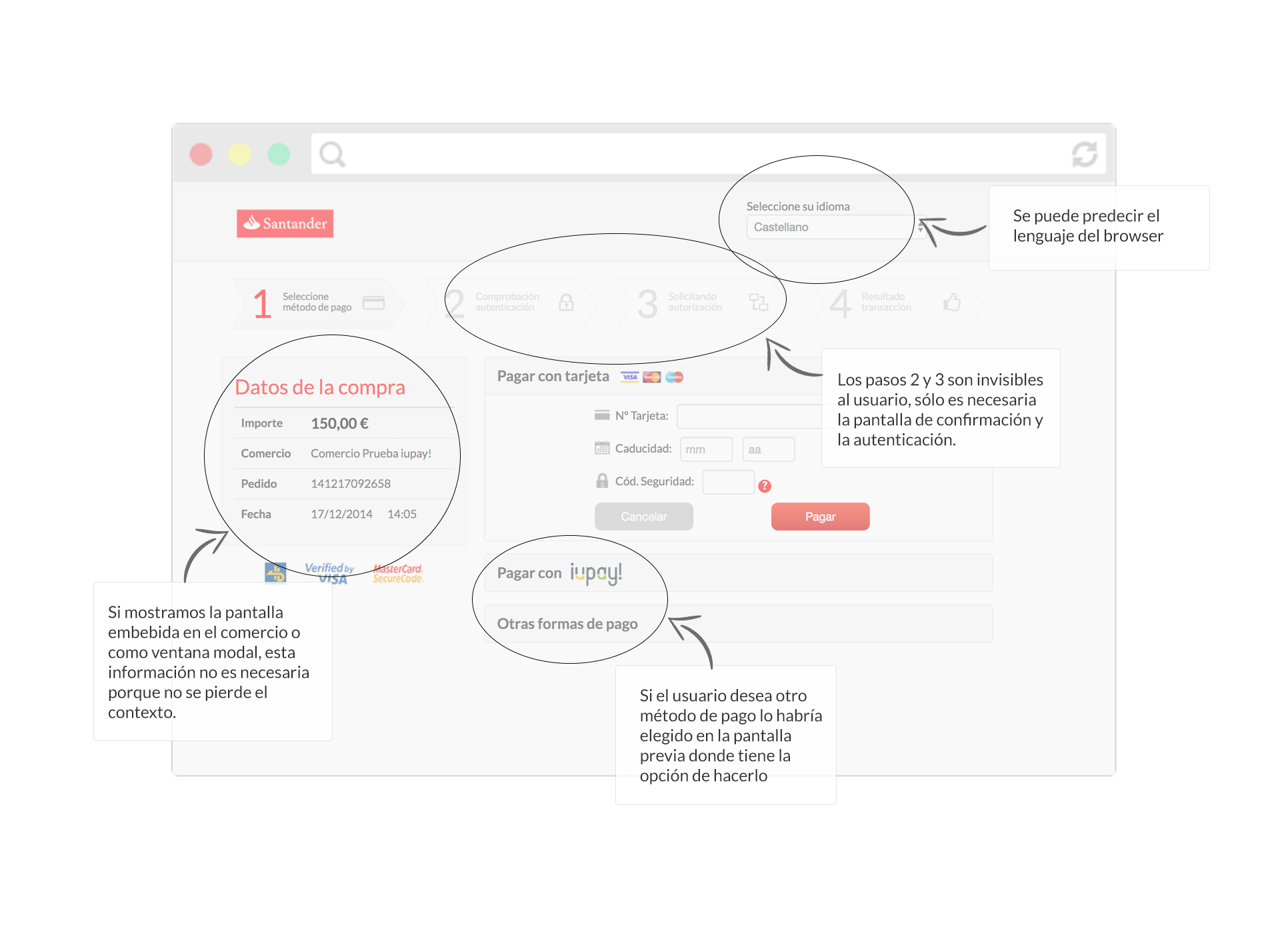
On mobile, the modal window could go unnoticed and sometimes the user felt they had left the merchant’s website. Our recommendation was always to embed the payment gateway within the merchant site, but for technical and security reasons this wasn’t always possible, so we had to keep purchase information on the mobile version to maintain context.
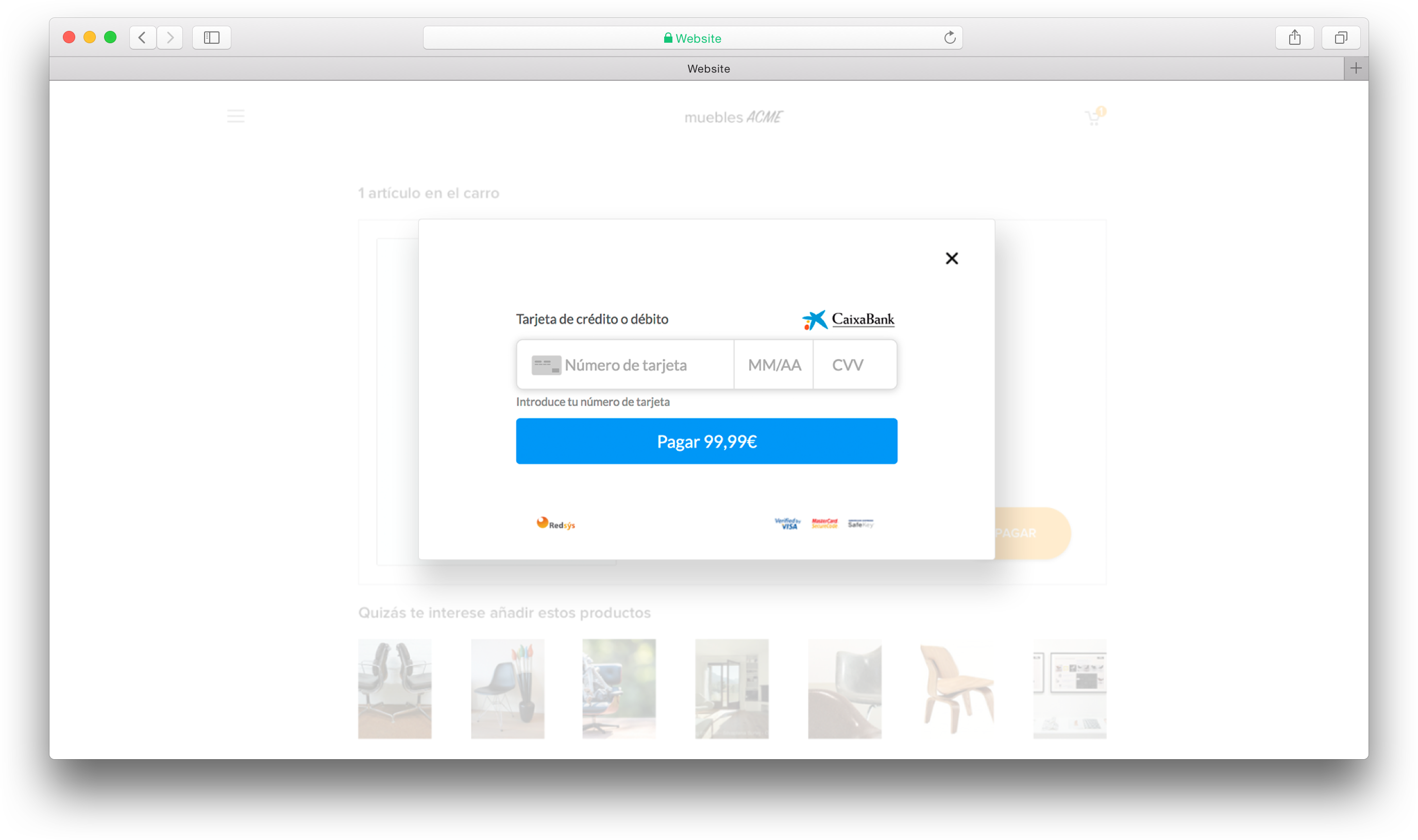
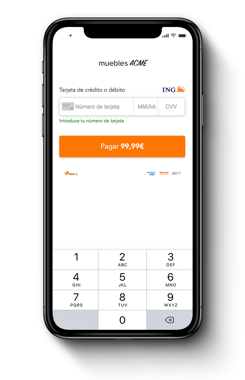
We left only the necessary elements to make the payment. We got rid of the steps, the commerce info, the other payment methods, the language… Besides, we avoided launching another window to fill the card number; we launched a modal window instead. This way the user doesn’t feel they’re leaving the e-commerce to complete the payment and it feels more secure.
The button to make the payment was the perfect place to put the price. When the user presses the button, they know exactly how much they are paying.
To make entering card details easier, we used an input mask to separate the numbers the same way they appear on the physical card. We also used an algorithm to predict the card brand and the Luhn algorithm to validate the card and prevent errors before pressing the continue button.
.jpg)
.jpg)
.jpg)
.jpg)
.jpg)
.jpg)